| |  | | | La creatività cambia registro. Si fa interprete di contaminazioni di ogni genere, dove i materiali perdono le connotazioni tradizionali e gli oggetti vivono una vita alternativa. Ma, oggi, è necessario guardare anche a Internet, per trovare nuove vie di sconfinamento verso l’“altro”. Storia di creativi, che operano al di fuori dei canali consueti... con grande soddisfazione.
Luciana Guidotti, Stefano Lavorini
| |  | | |  | Gianluca Piroli (fondatore di Man Made srl insieme a Vincenzo Badessa) è tutto lì da vedere. Così come i prodotti generati dalla sua fantasia, che arredano la sede della società, in una vecchia cartiera della Zecca di Stato che compare, inaspettata, nelle campagne intorno a Vignola.
Ha l’istinto del comunicatore, è accattivante nei modi e nel sorriso, ma determinato nelle scelte, con grandi progetti per il futuro. E, quel che più conta, ha un proponimento encomiabile, da cui non sembra proprio poter derogare: lavorare con tutto l’entusiasmo e la curiosità possibili, così da migliorare la qualità della vita, propria e di chi gli sta vicino.
È arrivato all’imballaggio per vie traverse, passando dalle agenzie di pubblicità e dalla progettazione dei punti vendita, sviluppando, in 16 anni di attività, collaborazioni importanti con i produttori della moda “casual” (i jeansaroli, come si definiscono) e in ambito cosmetico.
Per loro ha saputo interpretare il punto vendita come un micro-mondo accogliente e vivace, capace di coinvolgere il pubblico con sensazioni forti e immediatamente riconoscibili.
Sfruttando le conoscenze tecniche sui materiali e sulle possibilità di lavorarli nei modi più vari, ha di volta in volta proposto ambienti ricreati ad arte, lavorando molto per ottenere bruschi e insospettabili spostamenti di piano e di percorso logico: espositori e mobili che sembrano fustellati di cartone, e invece sono di metallo; legni o oggetti invecchiati, che non intendono imbrogliare nessuno ma diventano il mezzo per comunicare un gusto “old America” (come nel caso dei punti vendita Replay, premiati qualche anno fa negli USA come migliori negozi in stile country); e poi ancora, termoformati che da espositori si trasformano in imballaggi a tutti gli effetti.
Ecco perché, studiando quindi materiali e forme, Piroli non poteva non arrivare a considerare l’imballaggio come un elemento fondamentale di quel legame sottile, ma tenace, fra prodotto e utilizzatore. Tuttavia, se il suo approccio al pubblico passa ancora molto attraverso sensazioni concrete e tattili, sta comunque pensando di proporre un tocco di “virtualità”: ai giorni nostri, non guasta e, se ben interpretata, potrà suggerire nuove opportunità alla comunicazione e al commercio.
Il “trovaimmagini”
La natura del Piroli “trovaimmagini” (parafrasando in modo benevolo quei trovarobe del cinema, che hanno fatto la fortuna di tanti film) ha avuto una genesi casuale e, come anticipato, non strettamente legata al packaging. Dopo le prime esperienze in alcune agenzie di pubblicità, viene infatti chiamato a scoprire nuovi usi per i materiali più tradizionali, così da contestualizzare gli oggetti a seconda delle esigenze di questo o quel punto vendita. E, in fatto di imballaggio, tutto ebbe inizio nel momento in cui gli fu chiesto di trovare il modo di abbinare a dei jeans una “retrotasca”, che contenesse i sassolini da utilizzare per il loro lavaggio (eravamo agli albori dei capi “stone washed”). La soluzione, in quel caso, venne mediata prendendo spunto dai blister di cartone, utilizzati normalmente per l’esposizione delle batterie.
Il resto è tutto merito del gusto per la sperimentazione e, di vetrina in vetrina, di espositore in espositore, Piroli ha incominciato 6 anni fa a progettare “seriamente” imballaggi, dando risposta alle richieste di alcuni clienti, che col tempo gli hanno anche affidato la cura della propria immagine tout court.
«Ci siamo convinti che per trasferire in modo corretto la filosofia dell’azienda ai clienti finali, ovvero per elaborare un’immagine che crei differenziazione, - spiega Piroli - sia necessario inserire il prodotto nel contesto più ampio possibile, partendo dall’imballaggio per arrivare al punto vendita, luogo delle contaminazioni per eccellenza. E proprio in questo modo, in carenza di risorse ingenti da dedicare a campagne promozionali sui media, è possibile ottenere interessanti risultati di mercato».
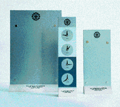
La possibilità di usare in modo alternativo i materiali, per inventare nuove modalità di presentazione, è ben illustrato dal caso ErbaVoglio, marchio di prodotti erboristici, per il quale Piroli svolge la funzione di direttore artistico: dalla creazione del marchio, a quella dell’immagine del prodotto, del packaging e dell’espositore... Proprio per ErbaVoglio ha realizzato un imballaggio termoformato, stampato in quadricromia (utilizzato di norma nel campo della pubblicità), che “parla da sé” e relativo espositore.
«In questo caso abbiamo privilegiato lo studio della forma di un contenitore che, al di là dei claim promozionali, rendesse esplicito il richiamo alla funzione del rassodante per glutei in questione, giocando sulla sua inequivocabile forma anatomica. Inoltre, dato che il packaging non è impilabile a scaffale, abbiamo inventato il relativo display da banco, facendo sì che il sistema imballaggio/espositore assolutamente funzionale alle esigenze di vendita del prodotto, con risultati molto soddisfacenti».
Giocare l’atout della conoscenza
Tramite la società Man Made - che “produce” gli oggetti - e la Acme - che ne “crea” invece il concept e cura l’immagine in senso più ampio - Piroli ha realizzato le cose più disparate per Wrangler, Replay, Fossil, Floor Gres, Ceramiche Ragno, Gianfranco Ferre, Spalding and Bros., Cotton Belt, Missoni, Mason’s, ma anche per case di maglieria più tradizionali. E poi ancora packaging per prodotti per la profumazione di ambienti.
«Fantasia e curiosità a parte, abbiamo puntato molto sull’aspetto tecnico del nostro lavoro» ci racconta Piroli «perché, col tempo, abbiamo imparato ad affrontare e interpretare, grazie al travaso di tecnologie da un settore all’altro, tanti tipi di materiale (dal metallo al legno, dal plexiglas alle materie plastiche, dalla carta al bambù). E nella progettazione di packaging, queste competenze sono state un’arma vincente, svincolandoci da molti limiti creativi e concedendoci di travasare nella fisicità del pack il gusto, l’atmosfera, i valori che caratterizzano un prodotto».
E, a sostegno della più ampia libertà di “creazione”, Piroli ha organizzato l’attività delle sue due società (Man Made e Acme, appunto) così da fornire un servizio completo, che spazia dalla consulenza sulla comunicazione e sull’immagine, fino a un supporto nella scelta e nella supervisione dei fornitori di imballaggio.
«Abbiamo un approccio diretto mirato in funzione delle esigenze di quelle PMI che, non avendo al proprio interno una struttura dedicata, possono trovare soluzione in termini generali ai loro problemi di immagine... non solo per un singolo prodotto, ma in termini più generali di comunicazione verso il cliente finale».
E per il futuro...
Sempre intorno alla comunicazione ruota peraltro l’ultima “pensata” di Piroli, che intende portare la tecnologia sul punto vendita, interpretandola a modo suo e sviluppando in modo originale la possibile relazione tra packaging e web. «L’obiettivo che mi sono dato - esemplifica il creativo - è di consentire a un direttore marketing di comunicare in tempo reale un messaggio al consumatore (informazioni sulle promozioni o su nuovi prodotti) direttamente nel punto vendita. Utilizzando reti satellitari, in pratica, sto puntando a fare le promozioni “in diretta”, su schermi appositi collegati presso la grande distribuzione. Stiamo facendo molta ricerca in merito e siamo a buon punto, ma ora bisogna trovare l’azienda sensibile a questo tipo di ragionamento, che capisca il valore potenziale di un’operazione del genere».
Se così sarà tra poco, in testa alla gondola non troveremo più il familiare display pallet ma un video, attraverso cui il consumatore potrà sperimentare nuove modalità di comunicazione interattiva, fino ad arrivare all’acquisto on-line, garantito e mediato dal supermercato, di prodotti non in assortimento sul punto di vendita.
«Intendiamoci bene, non ritengo che si possa fare a meno dell’imballaggio - conclude Piroli - bensì penso a un nuovo modo di vendere packaging e prodotto».
| | Masters in contamination
Creativity is changing register. It bears interpretations of contaminations of all kinds, where materials lose their traditional connotations and the objects live an alternative life. But these days one should also look to Internet to find new ways of extending out towards “otherness”. Accounts of creatives who work outside the usual channels... to great satisfaction. Luciana Guidotti,
Gianluca Piroli (founder of Man Made Srl along with Vincenzo Badessa) is there for all to see. The same goes for the products generated by his imagination, that decorate the company’s offices in an old papermill of the State Mint that rises up unexpectedly from the countryside around Vignola.
He has the instinct of the communicator, a winning way about him, but he is determined in his choices, and has set his sights on achieving some great projects for the future. Though what counts the most is his praiseworthy approach, something he cannot even help: that of working with all the enthusiasm and curiosity he can muster, in order to improve the quality of his life and of those who are close to him.
He came to packaging indirectly, via advertising agencies and by way of designing salespoints, developing important cooperative agreements with producers of fashion casual wear and those operating in the field of cosmetics in 16 years of activity.
For them he was able to turn the salespoint into a vivacious, cosy micro-world, capable of drawing the public into immediately recognizable sensations. Exploiting his technical knowhow as regards materials and the various ways of working the same, he has continued to propose specially designed ambients, striving to attain unexpected, sharp changes of level and of the logistical run of things: display cases and pieces of furniture that look like they are cardboard cut-outs, only they are made of metal; seasoned wood and objects, that are not out to fool anyone but that become a means for communicating an “old America” style (as in the case of the Replay salespoints, awarded as the best US shop in country style some years back); and again, heatformed items that turn from display cases into full packaging.
This is why, studying materials, shapes and forms, Piroli could not but help come to consider packaging as a fundamental element of that subtle yet sturdy link between producer and user. Although his approach to the public still passes a lot by way of concrete and tactile sensations, he is now thinking in terms of proposing a touch of “virtuality”: all the rage these days and something that if well interpreted might lead to new opportunities for communication and trade.
The “image finder”
As anticipated, Piroli’s role as “image finder” (benignly paraphrasing the cinema props finder, that literally “made” many films) was something of a fortuitous occurrence, not strictly linked to packaging. After gaining initial experience in several advertising agencies, he was in fact called upon to find new uses for the most traditional of materials, leading him to contextualise objects according to the requirements of this or that salespoint. And in terms of packaging, everything began when he was asked to find the way of giving jeans a back pocket that contained the gravel to be used in stone washing. The solution, in that case, was found by resorting to the cardboard blister, used normally for displaying batteries.
The rest is all merit to his taste for experimentation where going from one window dressing to another, display case to display case, Piroli began designing packaging “seriously” six years back, responding to the demands of some of his customers that with time have also entrusted him with looking after their image all told.
«We are convinced that in order to correctly transfer the philosophy of the company over to the end customer, or that is to devise an image that sets one apart from the others - Piroli goes on to explain - the product needs to be inserted in the broadest possible context, starting off from the packaging right down to the salespoint, place of contamination par excellence. This is how, lacking the considerable resources that one would need for a promotional campaign by way of the mass media, interesting results can be obtained on the market».
The possibility of using the materials in an alternative way, to invent new modes of presentation, is well illustrated in the case of the ErbaVoglio brand of herbal products, for which Piroli performs the function of artistic director: that takes him from the creation of the brand to looking after the product image, from packaging to the display case... It was for ErbaVoglio that he made a heatformed packaging that “speaks for itself”, printed using four color process (normally used in advertising), designed along with the relative display case.
«In this case we concentrated on the shape of the container that, over and beyond the advertising claims, highlighted the function of the product in question of toning up the gluteals, this by concentrating on its inequivocal anatomical shape. As well as that, given that the packaging was not stackable on the shelf, we invented a counter display case, making the packaging/display system perfectly functional as regards the sales requirements of the product, with most satisfying results».
Fielding full knowhow
By way of the company Man Made - that “produces” the objects and Acme - that in turn “creates” their concept and looks after their image in the broadest sense - Piroli has made the most various items for Wrangler, Replay, Fossil, Floor Gres, Ceramiche Ragno, Gianfranco Ferre, Spalding and Bros., Cotton Belt, Missoni, Mason’s, but also for the most traditional knitwear producers. And added to that he has worked on packaging for products for ambient perfumes.
«Imagination and curiosity apart, we have put a lot into the technical side of our work - Piroli goes on to say - because with time, we learned to deal with and to interpret many types of materials (from metal to wood, from plexiglass to plastics, from paper to bamboo) thanks to the transfer of technology from one sector to the other. And this knowhow has helped us win through in packaging design, allowing us to fly by many limits to creativity, allowing us to imbue the actual physical nature of the pack with style and atmosphere, the values that characterize a product».
And in support of the greater creative freedom, Piroli has organized the activity of the two companies (Man Made and Acme) so as to be able to supply a complete service, that ranges from consultancy to communication and image, up to support in choices and in the supervision of packaging suppliers.
«We have a direct approach aimed at satisfying the needs of the small-to-medium-sized concerns, that not having a dedicated structure inside their companies, are able to find solutions in general terms and in terms of their problems of image with us... not only for a single product, but in the more general communication towards the end customer».
And for the future...
Piroli’s other brainchild also revolves around communication, that intends bringing the technology to the salespoints, interpreting it in his own way by fostering the possible relations between packaging and the web in the most original of manners. «The objective that I set myself - he goes on to say - is to allow a marketing director to communicate his message to the consumer in real time (info on promotions or on new products) directly in the salespoint. Using satellite networks, practically speaking, I aim to advertise “live” as it were, on screens directly connected up to broadscale distribution.
We are doing a lot of studies on the subject and we are at a good stage, but now we have to find the company that is sensitive to this way of thinking, that understands the potential value of an operation of this kind».
If this will be the case, at the head of the gondola we will no longer find the familiar display pallet but a video screen, by way of which the consumer will be able to experiment new modes of interactive communication, up to achieving on-line purchase guaranteed and meted out by the supermarket, of products that are not part of the assortment at the salespoint.
«By which I don’t mean to say we will be able to do without packaging - Piroli concludes - rather I am thinking of a new way of selling both packaging and product».
| |  |
L’arte del POP
Dal primo display del mondo - un indiano in carne e ossa con tanto di copricapo di piume, braccia conserte e sguardo fiero piazzato di fronte alle tabaccherie statunitensi per attirare i clienti - sono cambiate molte cose.
In un secolo, il POP (point of purchase) si è appoggiato sempre meno al fai-da-te e sempre più a professionisti del settore, in grado di muoversi in un mercato dove il pubblico è molto frammentato, individuando i target da colpire. In genere, però, sembra che non abbia più senso affidarsi esclusivamente alle vecchie promozioni e anche la pubblicità patinata degli anni Ottanta, ormai non stupisce più nessuno.
La palla torna dunque al centro, e questa volta il calcio di inizio spetta alla distribuzione, dato che la partita si gioca in gran parte nel negozio.
Per questo è importante che un marchio possa essere immediatamente individuato all’interno del punto vendita: non solo per il logo e il nome dell’azienda, ma anche per l’atmosfera evocata, che deve far sognare il cliente, bisbigliargli all’orecchio nuove possibilità, senza tuttavia intimidirlo o irritarlo.
Da lusso a strategia di marketing
Attento alle nuove esigenze, il POP si evolve: non solo allestimenti per vetrine, espositori e price-list, ma decorazioni e materiali per tutto il negozio, oggetti che apparentemente non hanno molto a che vedere con il prodotto da vendere (cosa c’entrano le tazze di ceramica con i jeans?), ma che in realtà contribuiscono a creare una storia intorno al marchio, a dargli un’anima e a farlo apparire amichevole agli occhi del compratore. La vetrina allora, o meglio, tutto il negozio si trasforma in una specie di casa accogliente, dove il cliente si sente invitato a restare. Perché trova colori, materiali, forme che lo fanno sentire a suo agio. Via libera dunque a espositori in stoffa, carrellini portaoggetti in legno, ma anche candele profumate, tazzone, sagome in metallo. Con una preferenza per i materiali riciclabili o naturali. Oggetti che coinvolgono il compratore in una specie di rappresentazione, che non è mai la stessa, ma cambia a seconda della persona, della sua immaginazione, dei suoi desideri.
Ma l’obiettivo è unico. Creare nel cliente il desiderio di entrare in quel mondo e di far parte di quella storia. Come? Impossessandosene. Cioè, comprando i prodotti. Sembra proprio che funzioni!
Da una ricerca effettuata dal Popai USA (associazione di categoria nata per promuovere la comunicazione pubblicitaria nel punto vendita), su un campione di 4200 consumatori, risulta che il POP influenzi in modo significativo le decisioni di spesa è meno effimero di uno spot in TV). I consumatori vengono colpiti dagli espositori e dai price list, come conferma il fatto che la scelta della marca avviene all’interno del punto vendita nel 70% dei casi. Una percentuale che sale al 74% per gli acquisti effettuati nei centri commerciali e negli ipermercati. Per certe categorie di prodotti - come i giocattoli, gli articoli parafarmaceutici (il dentifricio per intenderci), quelli sportivi o gli accessori di abbigliamento - nel negozio avviene la quasi totalità delle scelte di acquisto. Nei supermercati, invece, i prodotti maggiormente sensibili alla presenza di materiale POP sono burro e margarina, biscotti, cereali, bevande analcoliche, sapone e birra. Non che i produttori non siano consapevoli di questa tendenza, visto che - sempre secondo il Popai USA - in America negli anni scorsi gli investimenti in promozioni sul punto vendita hanno quasi raggiunto quelli della pubblicità in TV (salendo a circa 12 miliardi di dollari). (Il testo è stato rielaborato sulla base di una nota redatta da Man Made Srl).
| |
POP art
A lot of things have changed from when the first display in the world - a red indian in the flesh complete with feather headdress, folded arms and proud gaze - was placed in front of the US tobacconists in order to draw custom. Over a century, POP (point of purchase) has resorted less and less to DIY and evermore to the professional operators covering the sector, capable of moving in a market where the public is very fragmented and locating the right targets. In general though, there no longer seems to be any sense in exclusively entrusting oneself to the old promotional techniques, and the glossy advertising of the eighties no longer seems to have any effect. Hence ball back to centre pitch, and this time it is distribution’s turn to kick off, given that for the most the match is played out on the shop premises. This is why it is important for the brand to be immediately locatable inside the salespoint: not only in terms of company logo and name, but also in terms of the atmosphere evoked; it has to be able to make customers dream, whispering new possibilities into their ears, without all the same being irritating or intimidating to the same in any way.
From luxury to marketing strategy
POP is evolving, and this with an eye to new requirements and demands: not only window dressing, display cases and pricelists, but decorations and materials for the entire shop, objects that don’t appear to have much in common with the product on sale (what have ceramic bowls got to do with jeans?), but that in reality contribute to creating a story around the brand, giving it a soul and making it appear friendly and appealing in the eyes of the buyer. The showcase that is, or better still, the entire shop is transformed into a kind of cosy home, where customers feel encouraged to stay on, a place where they can find colors, materials, shapes that make them feel at ease. Hence the way is open for display cases in fabric, wooden trolleys, but also perfumed candles, bowls, metal shapes.
All this with a preference for recyclable or natural materials. Objects that involve the buyer in a type of representation, that though is never the same twice over, that changes according to the person, their imagination, their desires. But there is one sole objective: that of creating in the customer the desire to enter into this world and to become part of the scene. How? By taking possession of it. That is, buying the products. It seems it really works! In a study carried out by Popai USA (a trade association that was created to promote advertising communication in the salespoint) involving a sample of 4200 consumers, POP was seen to have a heavy influence on purchasing decisions (proving less ephemeral than the TV ad). Consumers are struck by the display cases and by the pricelists, as is confirmed by the fact that the choice of brand is made inside the salespoint in 70% of the cases, a percentage that reaches 74% for purchases made in shopping malls and in hypermarkets.
For certain product categories - such as toys, parapharmaceutical products (meaning toothpaste etc), sports items and clothing accessories - virtually all purchasing choices are made on shop premises. In turn in the supermarkets the products affected the most by the presence of POP material are butter and margarine, biscuits, cereals, non-alcoholic drinks, soaps and beer. Not that the producers are unaware of these trends, given that - still according to Popai USA - in the US over the last few years investments in promotion at the salespoint have almost equalled those in TV advertising (reaching some 12 billion dollars). (This piece has been re-elaborated on the basis of a note drawn up by Man Made Srl). | | | |