| | | | |  | |  | |
Parafrasando Mussorgsky, parliamo di fragranze, moda e tendenze e della serata speciale dedicata all’Accademia del Profumo. Che quest’anno ha presentato le 28 nomination al Premio in una mostra davvero speciale: eccone i packaging e le tendenze, con un commento di Roberto de Silva.
Elena Piccinelli
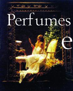
| | | |  | | | Fate conto di passare, scostando veli leggeri, un’impalpabile cortina fucsia e arancio e di ritrovarvi, dietro lo specchio, in un’altra epoca e in un altro luogo.
Al centro di un loft dalle luci basse, addobbato come a un banchetto di corte, un palco, e sopra il palco una statua vivente, ma immota. Alle pareti grandi quadri racchiusi in pesanti cornici dorate ripropongono celebri dipinti “interpretati” da uomini e donne in carne e ossa, acconciamente paludati e disposti su sfondi fioriti e fruttati.
Nell’aria, ovviamente, musica, ma soprattutto profumi, scaturiti dai cesti di arance o di zagare posti alla base delle inedite pitture e mirabilmente composti senza sovrapporsi (incredibile!) né appesantire l’aria.
Questa la suggestiva messa in scena allestita lo scorso 20 febbraio al milanese Spazio Antologico dallo Studio Festi in onore delle 28 nomination al premio Accademia del Profumo, con l’intervento tecnico e artistico di Oikos per la profumazione d’ambiente. Valerio Festi ha interpretato il tema della serata - “Il senso del profumo” - partendo dal concetto che l’uomo è il solo animale in grado di associare fra loro gli stimoli dei cinque sensi (guadagnando il piacere), e dall’idea che è l’odorato a fare da guida a questa integrazione. Ecco quindi il “principe” dei sensi fare da anfitrione agli altri, e ai convitati: giornalisti, PR, profumieri e amici dell’Accademia, stimolati dalla suggestiva composizione di odori, oggetti, suoni, cibi e materiali.
Haute Parfum: il profumo che fa Moda
È la prima volta che l’Accademia dedica ai propri finalisti un evento che precede e introduce il consueto galà del Cosmoprof, dove il prossimo 22 aprile verranno consegnati gli Oscar ai prodotti maschili e femminili eccellenti, per fragranza, packaging e comunicazione. Si tratta di un impegno coerente con le altre iniziative messe in campo per consolidare nel grande pubblico un’adeguata cultura del profumo, che ne riconosca il ruolo e l’importanza così come è già avvenuto, grazie a decenni di promozione dell’immagine, per l’Haute Couture (non a caso la serata milanese ha ottenuto il patrocinio della Camera Nazionale della Moda Italiana).
Per questo, il concorso ha fatto un ulteriore salto di qualità, coinvolgendo il pubblico per formare una terza giuria popolare accanto a quelle dei “tecnici” e dei profumieri. Veicolato dai grandi media - TV, radio, cinema, quotidiani e periodici - il progetto ha richiesto un notevole sforzo finanziario e organizzativo (la campagna è costata 15 miliardi) e, al momento in cui scriviamo, ha già raccolto migliaia di adesioni, da parte di altrettanti cittadini contenti di partecipare e desiderosi di vincere un “viaggio in terre odorose” (Bali).
Più’ vicini al mercato
Il coinvolgimento del pubblico nella giuria è stato promosso dall’attuale direzione dell’Accademia del Profumo, presieduta da Roberto de Silva. L’operazione non è da poco: nel momento in cui ai profumieri e al trade si affianca l’assai più numeroso universo degli acquirenti, la competizione si trasforma da autopromozione di imprenditori illuminati a consultazione di massa (con il relativo margine di alea, ma anche di popolarità).
Questa maggior vicinanza al mercato è coerente con il già citato intento di edificare un’idea del profumo affine a quella della moda. Ma attenzione, avverte il presidente dell’Accademia, mentre un abito è disegnato per durare una stagione, la vita media di un profumo è di qualche anno. Si tratta di una differenza importante, che si riflette sull’immagine e quindi anche sul packaging di prodotto, che infatti è mediamente meno stravagante e provocatorio di altri “accessori” griffati. È questa, secondo de Silva, la chiave per interpretare fenomeni come la relativa omogeneità dei colori scelti per gli astucci (proprio nel 2000, in cui abbiamo assistito nella moda al trionfo del colore e spesso dell’orpello!), e dell’understatement, che domina in particolare i prodotti maschili.
E a proposito di understatement: vale sempre l’aurea considerazione che se il profumo vuole uscire dalla nicchia (e lo vuole, anzi lo ha già fatto) deve incontrare il gusto delle masse che, per quanto “targettizzabili”, esprimono in media un gusto e una concezione dei ruoli sessuati assai più tradizionali di quelli veicolati dalle pubblicità dei vestiti.
Considerazioni essenziali
E le essenze? Anch’esse riflettono le tendenze della moda e contribuiscono a formare quel prodotto composito che è il profumo. Nel 2000, commenta il presidente dell’Accademia, nell’universo dei femminili hanno dominato le famiglie fiorite, con fondi orientaleggianti alleggeriti da note fresche, mentre i maschili si sono caratterizzati, in genere, per i toni aromatici e legnosi. Più accentuati i caratteri dei profumi firmati dai grandi stilisti, dove si trovano le essenze forti e speziate che segnano anche gli orientamenti dell’anno in corso.
Nel complesso - considera poi de Silva - il mercato italiano è maturato e se da un lato presenta ancora ampi margini di crescita, dall’altro è meno fragile di un tempo. Così, il Made in Italy incassa i primi successi: l’anno scorso il fatturato di settore ha superato i 1.500 miliardi, in aumento del 9,5% sul ‘99, di cui 1.000 riferiti dai prodotti femminili e 500 ai maschili. Ma non solo. «L’industria italiana sta finalmente perdendo i complessi d’inferiorità nei confronti dei francesi e degli americani e inizia a esportare quote significative di prodotto», ritrovando un orgoglio ben fondato se è vero che è stata Caterina De Medici a insegnare ai francesi l’arte di profumarsi.
Ora, conclude il presidente dell’Accademia, resta da aiutare il pubblico a sdrammatizzare l’atto dell’acquisto e il negoziante a superare gli atteggiamenti che intimidiscono (sicuramente l’uomo, ma anche la donna) e che sono alla base, fra l’altro, del progressivo successo delle superfici a libero servizio.
| | Perfumes at an exhibition
Paraphrasing Mussorgsky, let’s talk of fragrances, fashion and trends and the dedicated gala evening at the Italian Academy of Perfume. This year saw 28 nominations for the Award presented in a really spectacular show: here are the trends and packaging, with a comment from Roberto de Silva.
Imagine, as you move aside light veils, that you pass through an intangible pink and orange curtain, only to find yourself behind the mirror, in another time and place.
At the centre of a loft with low lights, decorated as though for a court banquet, a stand and on top of the stand a living, but immobile statue. The large, square walls are hung with pictures in heavy gilt frames with copies of famous paintings “interpreted” by men and women in flesh and blood, dressed up and arranged on flower-strewn and fruit backgrounds.
Obviously, the air is filled with music, but perfumes more than anything else, bursting from the baskets of oranges and orange-blossom at the base of these unusual paintings and cleverly arranged without overlapping (incredibly!) or making the air heavy.
This is the evocative scene staged on 20th February at the Milan exhibition entitled Anthological Space by Studio Festi to honour the 28 nominations for the Italian Perfume Academy Awards, with technical and artistic input from Oikos for ambience fragrancing.
Valerio Festi interpreted the theme of the evening - “The sense of perfume” - by starting from the concept that man is the only animal capable of associating the stimuli of all five senses (and thus gaining pleasure), and from the idea that the sense of smell acts a guide in this process of integration. Here, then, the “prince” of the senses acts as the host for the others, and the invited guests: journalists, PR officers, perfumers and friends of the Academy, stimulated by the entrancing composition of aromas, objects, sounds, food and materials.
Haute Parfum: trend-setting perfumes
This is the first time that the Academy has dedicated an event dedicated to the finalists to precede and introduce the usual Cosmoprof gala, where the Oscars will be handed out this coming 22nd April to the winning male and female products, in the categories of fragrance, packaging and communication. This commitment is coherent with the other initiatives introduced to consolidate a suitable culture of perfume in the public at large, recognising its role and importance, as has also been the case, thanks to decades of image promotion in Haute Couture (it’s no coincidence that the evening in Milan was sponsored by the National Chamber for Italian Fashion).
Indeed, for this reason, the competition has changed radically, involving the public to form a third jury - a people’s jury - alongside the “technicians” and perfumers’ juries. Carried in the mass media - TV, radio, cinema, daily papers and magazines - the project has called for considerable efforts in funding and organisation (the campaign has cost 15 billion Lira) and, at the time of writing this article, thousands of people have already responded, citizens happy to take part and wanting to win a “trip to fragrant lands” (Bali).
Closer to the market
The involvement of the public in the jury has been promoted by the current management of the Italian Perfume Academy, chaired by Roberto de Silva. The operation is by no means an easy one: when perfumers and the trade are joined by the far larger ranks of purchasers, the competition changes from being an opportunity for self-promotion by illuminated businessmen to an exercise in mass consultation (with a corresponding margin of risk, but also of popularity).
This becoming closer to the market is in line with the already mentioned intent to build up the idea of perfume like that of fashion. But beware, warns the president of the Academy, while a dress is designed to last a season, the average life of a perfume is several years. This is an important difference, which reflects on the image and so also on the product packaging, which on average is less extravagant and provocative that other designer “accessories”. This, according to de Silva, is the key to interpreting phenomena such as the relative sameness of the colors chosen for the boxes (even in 2000, a year when we saw color triumph once again in fashion, and even tinsel!) and understatement, which especially dominates the products for men.
While on the subject of understatement, the golden rule is always valid: that if perfume wants to move out its niche (and it does, indeed it already has), it must satisfy the taste of the masses who, although “targetable”, generally have far more traditional tastes and conception of the roles of the sexes than those carried in the fashion adverts.
Essential considerations
And the essences? These two reflect fashion trends and contribute in forming that compound product that is perfume. In 2000, comments the president of the Academy, flowery families have dominated the world of female fragrances, with oriental bases lightened by fresh notes, while the perfumes for men are generally characterised by aromatic and woody tones. The characters of the perfumes proposed by leading designers are more marked, with strong spicy essences indicating also the trend for the current year.
Overall - reckons de Silva - the Italian market has become mature and while there may still be plenty of room for growth, it’s also less fragile than it used to be.
Thus, perfumes with the Made in Italy label has gained their first successes: turnover for this sector last year exceeded 1,500 billion Lira, an increase of 9.5% on 1999, with 1,000 coming from female products and 500 male products. But that’s not all. “The Italian industry has finally started to lose its inferiority complex when it comes to the French and the Americans and is now starting to export a significant percentage of its products” - rediscovering a certain amount of national pride if it’s true that Caterina De Medici was indeed the person responsible for teaching the French the art of using perfume.
Now, concludes the president of the Academy, we have to help the public get over the drama of purchasing a perfume and help the seller to overcome those intimidating attitudes (definitely intimidating for men, but also for women) and which are a basic reason, among other things, for the growing success of self-service counters. | | | | |
Al Cosmoprof
La 34a edizione del Cosmoprof può già festeggiare un importante traguardo - un sito web ampiamente attivo e molto visitato, con un tempo medio di collegamento superiore ai 12 minuti - e un record: la superficie netta occupata dai 1.700 espositori ha raggiunto i 70.000 m2 (3.000 più dell’anno scorso), occupando l’intero spazio espositivo bolognese. La più grande fiera mondiale della bellezza mette in mostra cosmetici e profumi, prodotti professionali per capelli e articoli per acconciatori, articoli da regalo, bigiotteria, prodotti per l’estetica, attrezzature per i negozi e - secondo settore per numero di espositori - imballaggio e confezionamento, di cui sono messi in mostra, in un padiglione dedicato, materiali, prodotti e macchine. Al momento in cui scriviamo, sono state stabilite anche alcune date del calendario di incontri, fra cui la serata inaugurale del 19 aprile e la presentazione del consuntivo di settore (dati Unipro) e delle previsioni sui consumi del prossimo triennio (a cura di Prometeia) il venerdì 20/3/01. L’assegnazione dei premi Accademia del Profumo è invece prevista per domenica 22 a Palazzo Albergati, quando verranno anche estratti, fra i votanti via Internet, i vincitori dei viaggi a Bali.
| |
At Cosmoprof
The 34th edition of Cosmoprof can already celebrate an important goal - a highly active and much visited website, with average connection times of more than 12 minutes - and a new record: the net surface occupied by the 1,700 exhibitors has now reached 70,000 m2 (3,000 more than last year), occupying all the exhibition space available in Bologna. The world’s largest beauty fair is the moment to show cosmetics and perfumes, professional hair products and items for hairdressers, gift items, dress jewellery, products for beauticians, equipment for shops and - the second sector in terms of number of exhibitors - packaging and packing, with machines, products and materials on show in a dedicated pavilion. At the time of writing this article, the dates of some of the planned meetings have been confirmed, including the inaugural evening of 19th April and the presentation of the balance for the sector (Unipro data) and forecasts for consumption over the next three-year period (by Prometeia) on Friday 20/3/01. The Perfume Academy Awards Ceremony is planned for Sunday 22nd at the Palazzo Albergati, when the names of the winners of a trip to Bali will also be extracted from among the Internet voters.
| | | | | | | |  | | | | | | Cerruti Image Woman
Parfums Int., divisione Unilever Cosmetics Int.
Packaging design: Thierry De Baschmakoff
Natura e (s)cultura - Vibrante come il peperoncino, “metropolitana” come il carbone, equilibrata in un mix sapiente di betulla, cuoio, legni chiari e ambra: è la sapiente architettura elaborata per la donna, colta e naturale insieme, di Cerruti. Thierry De Baschmakoff ne riprende le dicotomie interpretando in chiave femminile la bottiglia del profumo per Lui e produce una morbida forma slanciata dove si alternano trasparenze cristalline e opacità satinate. La chiusura antropomorfa di metallo ne accentua la modernità, mentre alla scatola, di un arancione intenso e naturale, è assegnato il compito di comunicare calore, ottimismo ed energia positiva.
Nature and (non)culture - Vibrant like red hot chilli, “metropolitan” like coal, balanced in a clever mix of birch, leather, pale wood and amber: this is the clever architecture developed by Cerruti for the cultured yet natural woman. Thierry De Baschmakoff takes up the dichotomy, giving a female interpretation to the perfume bottle for Him and producing a soft, slender shape where the transparency of crystal and matt of satin alternate. The anthropomorphic metal closure stresses the modern look, while the intense natural orange box has the task of getting across a sense of warmth, optimism and positive energy.
Alessandro dell’Acqua
Euroitalia
Packaging design: Ateliers Dinand
Amabile, con stile - Sorprendente e amabilissimo, il profumo creato da Firmenich per lo stilista napoletano compone una sinfonia di note dolci come la rosa, piccanti come il coriandolo e fresche come il pelargonium, su un fondo sensuale di sandalo e incensi. Sofisticato e amabile anche il pack, imperniato sulla boccetta semplice in cui giocano un ruolo determinante la chiusura di metallo color tortora e il nastro di elastico nero, che avvolge a metà il tappo e poi sporge a “coda di cavallo”. Lo stesso elastico viene riprodotto in un sapiente gioco di grafismi, rilievi e impressioni in oro sull’astuccio nero operato.
Good-natured, with style - Surprising and extremely good-natured, the perfume created by Firmenich for the Neapolitan designer creates a symphony of notes that are sweet like a rose, spicy like coriander and fresh like pelargonium, on a sensual backdrop of sandal and incense. The pack is also sophisticated and good-natured, hinged on the simple bottle where the dove-grey metal closure plays a decisive role together with the black elastic band that half covers the cap and then sticks out like a “horsetail”. This elastic is also reproduced in a clever mix of golden graphics, relief and printing on the black damask box.
Mania - Giorgio Armani Parfums
Helena Rubinstein Italia
Packaging design: Fabien Baron
Profumi d’Oriente - Dal sultanato di Oman il fresco incenso di Mania, addolcito da muschi e zafferano, e da un soffio di vaniglia. Bergamotto, fiore d’arancio, noce moscata, garofano, legno di gaiac, iris... per 25 ingredienti di una formula semplice.
La boccetta di vetro satinato si sviluppa in un’ellissi verticale, con i due lati concavi che facilitano e rendono piacevole la presa. La severità dell’astuccio nero, che ammicca al coté androgino della donna moderna, è stemperata dalle sottilissime righe argentate e dalla matericità della trama.
Perfumes from the Orient - From the Sultanate of Oman, the fresh incense of Mania, sweetened by musks and saffron, plus a hint of vanilla. Bergamot, orange blossom, nutmeg, cloves, gaiac wood, iris... 25 ingredients in a simple formula.
The satin-finish glass bottle has a vertical ellipse shape, with two concave sides for an easy, pleasurable grip. The severe lines of the black box, which tempts the male side of today’s woman, are diluted by the particularly fine silver lines and the texture of the weft.
Mauboussin
Satinine
Packaging design: Thierry de Baschmakoff
Come un gioiello - Dall’inizio del secolo scorso è celebre per la purezza delle sue gemme e dal negozio di Place Vendôme ha servito i potenti di tutto il mondo. Oggi si regala un nuovo marchio - viola, cromo e rosso - e il suo primo profumo dalla fragranza voluttuosa di fiori bianchi rari e legni orientali. Creato per festeggiare il 2000, in collaborazione con due “pari grado” per la fragranza e il packaging (Christine Nagel per Quest e Thierry de Bachmakoff), si presenta, naturalmente, in un gioiello di boccetta. Che nega subito ciò che ha appena affermato: la severa piramide smussa gli angoli e diventa bombata; la base piatta si gonfia conferendo mobilità al contenitore; la punta argentata suggerisce staticità mentre va ruotata per consentire l’erogazione. E altri preziosi dettagli ancora, dalla goccia di vetro che sigilla la punta alla superficie iridescente del vetro (Pochet e de Courval) spruzzato di titanio. Chic la scatola viola dalla larga fascia di metallo a specchio (Draeger), che svela un cuore rosso fuoco.
Like a jewel - Ever since the beginning of the last century, they’ve been famous for the purity of their gems and the shop in Place Vendôme has served the rich and powerful from around the world. Today they’ve given themselves a new trademark - purple, chrome and red - and the first perfume with a voluptuous fragrance of rare white flowers and oriental wood. Created to celebrate the year 2000, in cooperation with two “of equal standing” when it comes to fragrance and packaging (Christine Nagel for Quest and Thierry de Bachmakoff), it is, naturally, in a jewel of a bottle. Which immediately denies what has just been said: the severe pyramid has smoothed corners and becomes rounded; the flat base swells to give a sense of mobility to the container; the silver tip suggests immobility, but needs to be turned to deliver the contents. And yet more fine details, from the glass droplet that seals the tip to the iridescent surface of the glass (Pochet and de Courval) sprayed with titanium. The purple box is very chic with its wide mirror-like metal band (Draeger), revealing a fiery red heart.
Cristobal Balenciaga
Jacques Bogart Italia
Packaging design: Aesthete, Thierry De Baschmakoff
Preziosità - È un omaggio al grande sarto di origine spagnola e allo stile francese che ha interpretato dando vita a una delle grandi maison della moda. In suo onore è stata creata una fragranza importante, orientale e sensuale eppure sobria e classica, presentata in una boccetta di lusso, “vestita” di un astuccio color bronzo. Mosso come un drappo, il flacone squadrato termina nel collo simbolicamente avvolto da un filo e culmina in un gioiello di tappo che sintetizza le linee del barocco spagnolo e della modernità alla Balenciaga.
Preciousness - This is a homage to the great Spanish tailor and to the French style he interpreted to give life to one of the greatest fashion houses. In his honour, an important fragrance has been created: oriental and sensual, yet sober and classic, presented in a luxury bottle, “dressed” in a bronze box. Wavy like a cloth, the square-based bottle ends with a neck symbolically encircled by a thread and culminating in a jewel of a cap that sums up the Baroque Spanish lines and modernity à la Balenciaga.
Blu
Bulgari Parfums
Packaging design: Aesthete
Grandi contrasti - Freddo come la passione, lo zenzero di Blu apre ghiacciato su un cuore focoso, pungente di bergamotto e sensuale di vaniglie e acacia. Sullo sfondo muschio e legno. Eppure è donna... e la femminilità rispunta col glicine e il fiore di lino.
La classica modernità della bottiglia squadrata riprende il “décolleté” e il logo argentato tipici delle altri fragranze Bulgari. In stile la scatola (Cartografica Pusterla), dello stesso blu intenso della bottiglia e del tappo, con il nome del profumo in argento brillante.
Great contrasts - Cold as passion, the icy ginger of Blu opens up to a fiery heart, pungent with bergamot and sensual with vanilla and acacia. A backdrop of musk and wood. And yet it’s woman... and the femininity comes up again with wisteria and flax flowers.
The classic modern lines of the square bottle picks up the “décolleté” and the silver logo typical of the other Bulgari fragrances. The matching box (Cartografica Pusterla), with the same intense blue as the bottle and cap, has the name of the perfume written on it in shiny silver.
Green Tea Scent Spray
Elizabeth Arden
Packaging design: Michelle Nahum
Energia verde - Le celebrate proprietà energizzanti del tè verde fanno da “colonna olfattiva” a una fragranza che esordisce con note agrumate e aromi intensi. Ma il cuore vivace sa di menta, garofano, finocchio e sedano (il centro è fiorito di gelsomino) e va a morire in un caldo fondo di muschi, ambra e quercia.
Lanciato negli Usa nel ‘99, Green Tea approda in Italia spinto dalla ricerca di un benessere fondato su una naturalità olistica e pacificante. Boccetta (Pochet America), tappo (Risdon/AMS) e cartone (Arko Paper) costituiscono un insieme solidale e armonico, l’una introdotta dall’altro attraverso la finestra sagomata a foglia che lascia vedere la metà complementare serigrafata sul vetro. Tutto è studiato nei particolari: l’astuccio bicolore, candido su una faccia e un fianco e verde tenue sugli altri, con mezza foglia argentata impressa a caldo e mezza solo sagomata (da vedere); il vetro semplice ed ergonomico che la completa; la grande capsula di identico colore, che scopre piccole spalle arrotondate e un erogatore mignon dalla testa verde.
Green energy - The celebrated energizing properties of green tea act as the “olfactory mainstay” for a fragrance here making its first appearance with citrus notes and intense aromas. But the lively heart smacks of mint, cloves, fennel and celery (while the flowery centre is of jasmine) and then dies away with a warm backdrop of musk, amber and oak.
Launched in the USA in ‘99, Green Tea is now launched in Italy driven by the search for well-being founded on holistic and calming naturopathy. The bottle (Pochet America), cap (Risdon/AMS) and box (Arko Paper) make up a solid and harmonious whole, one introduced into the other by means of a leaf-shaped window that lets one catch sight of half of the complementary graphics silk-screened on the glass. Great care has been taken in the details: the two-color box, candid on one face and one side, pale green on the others, with a silver leaf half hot-stamped and half simply outlined (seen beneath); the simple, ergonomic glass that completes this; the large cap in the same color, revealing small rounded shoulders and a mignon dispenser with a green head.
| | Flower by Kenzo
Kenzo Parfums Italia
Packaging design: Agence Air Paris
Poesie metropolitane - Persino la fragranza, incredibilmentedolce, commuove. Floreale e borotalcata (pardon, “poudré”), è aperta da violette, biancospino, gaggia e rosa bulgara, che introducono le note dominanti e avvolgenti di vaniglie e muschi e chiudono a sorpresa con note dinamiche e fresche.
Grazie Kenzo per regalarci un’altra delle tue poesie. Goccia di sentimento nell’oceano spigoloso della modernità, Flower fa capolino delicato come il papavero vermiglio impresso su un flacone puro, sottile e arcuato. Bianchissima la fustella a trama larga, su cui è fotografata la sequenza del fiore che nasce.
Ma dentro l’anima è rossa.
Metropolitan poetry - Even the fragrance, incredibly sweet, manages to move one. Flowery and talcky (sorry, “poudré”), it opens with violets, hawthorn, false acacia and Bulgar rose, introducing the dominant and enveloping notes of vanilla and musks, closing with surprisingly dynamic and fresh notes.
Thank you Kenzo for giving us another of your poems. A drop of sentiment in the prickly sea of modernity, Flower peeps out, as delicate as the scarlet red poppy stamped on the pure, thin and curved bottle. Pure white the broad die-cut box, bearing a sequence of photos showing the flower opening up. But inside the soul is red.
Azzura - Azzaro
Monarimport
Packaging design: Pochet, Katerine Krunas
Colori celesti - Sono i colori del Mediterraneo, evocati per presentare una fragranza agrumata e pulita come il viso della modella, simbolo della donna “che cammina a piedi nudi” a cui si rivolge la maison francese. Il bouquet fiorito-fruttato, dalle tonalità muschiate, poggia su accordi legnosi e rivela le femminili note del mughetto, del ciclamino e del non-ti-scordar-di-me.
È un sole arancione sospeso nelle aeree trasparenze del vetro il suggestivo pack di Azzura di Azzaro, e arancio è anche l’astuccio - cielo acceso di tramonto - che di azzurro (intenso e compatto) ha solo la volta e l’anima. La delicata boccetta piatta che si gonfia in corrispondenza del “sole” centrale, è resa ancor più evanescente dalla pompa trasparente ed è chiusa da un piccolo tappo tondo che poggia sulla grande frette dello stesso metallo.
Celestial colors - These are the colors of the Mediterranean, recalled here to present a citrus fragrance, as clean as the face of the model, the symbol of the woman “who walks barefoot” to whom the French house appeals. The flowery/fruity bouquet with undertones of musk, rests on wooden chords and reveals the feminine notes of lily of the valley, cyclamen and forget-me-not.
An orange sun hanging in the transparent areas of the glass, this is the attractive pack for Azzura by Azzaro, and the box is also orange - the sky lit up at sunset - where sky-blue (deep and compact) is used simply for the vault and centre. The delicate flat bottle that swells at the central “sun”, is made even more evanescent by the transparent pump and is closed by a small round cap that rests on the large skirting of the same metal.
Intuition - Estée Lauder
Packaging design: Estée Lauder, Serge Manseau (flacone)
Talismani di luce - Un astuccio chiaro ma intenso (Cartondruck) di sfumature gialle si apre sulle linee curve senza tempo del flacone asimmetrico (Pochet) imitato dal cappuccio trasparente (Qualipac). Scavata al centro - sul retro - una goccia d’ambra intrisa dei segreti della vita regala un grumo di luce e di calore che persiste nell’essenza tenace ma effervescente, fatta di erbe e agrumi mischiati a fiori innocenti. La completezza del bouquet floreale si deve all’opulenza del Double Delight (una rosa “difficile” di cui gli essenzieri sono riusciti a catturare per la prima volta il profumo) e all’azione di un nuovo ingrediente, denominato Voluminaire, che “traduce olfattivamente la sensazione di una carezza sulla pelle”.
Lucky charms of light - A clear but intense box (Cartondruck) with yellow shades opens up to reveal the timeless curved lines of the asymmetrical bottle (Pochet) imitated by the transparent cap (Qualipac). Dug out in the centre - but actually behind! - an amber droplet full of the secrets of life offers a chunk of light and heat that continues in the tenacious, effervescent essence, consisting of herbs and citrus fruit mixed with innocent flowers. The completeness of the bouquet of flowers is thanks to the opulence of the Double Delight (a “difficult” rose, whose perfume the essence extractors have managed to capture for the very first time) and the action of a new ingredient, called Voluminaire, that “translates into smell the sensation of a caress on the skin”.
Miracle
Lancôme
Packaging design: Areca
La luce del metallo - Carezze rosa di litchi e fresie trovano vigore nella magnolia generosa (nello zenzero e nel pepe), risvegliando sensualità ed energia con gli accordi di gelsomino unito a note muschiate e ambrate.
Il flacone di vetro si racchiude in un mano, piccolo tesoro di semplicità levigata e senza tempo a cui il tappo di metallo dona la luce del nuovo giorno. E poi ancora donna, nella fustella fucsia metallizzata, meravigliosa nella sua essenzialità. La luce interiore di Uma Thurman ha ben interpretato per Lancôme il “miracolo” della vita che si risveglia.
The light of metal - The pink embrace of lychees and freesias is given strength by generous magnolia (in ginger and pepper), reawakening sensuality and energy with the chords of jasmine united with musky and amber notes.
The glass bottle can be held in one hand, a small jewel of smooth, timeless simplicity with a metal cap offering the light of a new day. And then still woman, in the metallized fuchsia box, marvellous in its essentiality. The interior light of Uma Thurman perfectly interprets for Lancôme the “miracle” of life as it reawakens.
Versace Woman - Giver Profumi
Packaging design: Aesthete
Il piacere - Avvolgente e seduttiva, la fragranza persistente dell’ultimo Versace evoca una sensualità intensa e raffinata, dove frangipane e gelsomino, bergamotto, eglantine e lotus conducono per mano fino ai tocchi fruttati, ai legni preziosi e all’ambra. Coerente il flacone sinuoso, che si slancia verso l’alto giocando con spessori e trasparenze, mentre una fascia d’oro impreziosita da cristalli di ametista avvolge il collo della bottiglia, completata da un cappuccio sfaccettato come una gemma. La fustella cangiante brilla di sfumature rosa, tono su tono, in un gioco di effetti preziosi, sottolineati dalla scelta di tinte non banali. Da ricordare.
Pleasure - Enveloping and seductive, the latest long-lasting fragrance from Versace evokes intense and refined sensuality, where marzipan and jasmine, bergamot, eglantine and lotus lead one by the hand to fruity touches, noble woods and amber. The sinuous bottle is in keeping, reaching upwards, playing with thickness and transparency, while a golden sash encrusted with amethyst crystals winds itself around the neck of the bottle, complete with a gem-cut top. The brilliant bottle glitters with pink shades, in matching tones, to create a clever effect, underlined by the choice of by no means banal shades. Worth noting.
DKNY The fragrance for women - Donna Karan
Estée Lauder
Packaging design: Stephan Weiss
Ologramma di New York - Floreale, “metropolitano”, fresco come l’erba appena tagliata di Central Park, palpitante: Donna Karan interpreta così il profumo di New York, un cocktail energico di arance rosse e foglie di pomodoro rinforzate dalla vodka, con gigli d’acqua, orchidee verdi e giunchiglie, betulla bianca e corteccia di liriodendro. Fra le mani del marito, lo scultore Stephan Weiss, il contenitore di vetro assume le prospettive di un grattacielo che svetta sopra a tutto, dove facce smerigliate e trasparenti si alternano per ricomporsi in un tappo di plastica con ologramma. Alto in modo inusuale, è saldamente racchiuso in una doppia fascia argentata e trasparente, che riflette ad arte le luci della città.
A hologram of New York - Floral, “metropolitan”, fresh like newly cut grass in Central Park, vibrant: this is how Donna Karan interprets the New York perfume, an energetic cocktail of blood oranges and tomato leaves strengthened by vodka, with water lilies, green orchids and daffodils, white birch and the bark of the tulip tree. In the hands of her husband, the sculptor Stephan Weiss, the glass container assumes the lines of a skyscraper soaring above everything else, where ground, transparent faces alternate to come back together as a plastic cap with hologram. Unusually high, the bottle is securely closed in a double silver, transparent band reflecting the art of the city lights.
| | | | | |  | | | | | | That’s amore! Lui e That’s amore! Lei - Gai Mattiolo
ICR
Packaging design: Exergue
Strass e sentimento - Due giovani si abbracciano, confondendosi l’un l’altro ma senza perdere la propria indipendenza: come loro, le essenze volute dallo stilista hanno in comune le note armoniche dello Yuzu e del fiore dell’amore, declinate al maschile e al femminile per formare le due fragranze che, una volta riunite, ne compongono una terza e originale. L’idea profumata si visualizza nel pack complementare dei flaconi (vetro bianco satinato per lei, fumé trasparente per lui) dalla forma slanciata, completata da tappi sagomati che, affiancati, disegnano un cuore. Un regalo fiorito, personalizzato da Gai Mattiolo che firma in rilievo anche le confezioni esterne di PP (arancione-energia per l’uomo e malva-sensualità per la donna), realizzate dalla Cartografica Pusterla mischiando al colore quella manciata di strass che fa la differenza.
Strass and sentiment - Two young people embrace, merging into each other without losing their own independence: like them, the essences created by the stylist have common harmonious notes of Yuzu and the flower of love, split into male and female to create the two fragrances that, once reunited, make up a third, original one. The perfumed idea is shown on the complementary packing of the bottles (white satin glass for her, transparent smoked glass for him) with a slender shape, complete with shaped caps that, when side-by-side, form a heart. A flowery gift, personalised by Gai Mattiolo whose name also appears in relief on the outer PP packs (energy-orange for him and sensual-mauve for her), produced by Cartografica Pusterla, mixing a pinch of strass to colour to make all the difference.
| | Fluid Iceberg Man e Fluid Iceberg Woman
Eurocosmesi
Packaging design: Ateliers Dinand
Distinti e complementari - L’ombelico, centro della vita e del piacere, è il simbolo comune dei due Iceberg per Lui e per Lei: distinti nella fragranza morbida e informale e nel colore (rosso=donna, blu=uomo), ma complementari per “target” e confezione. Semplice perché lineare, in realtà il packaging denuncia l’esperienza dei designer ed è realizzato in maniera impeccabile: sia gli astucci grigi identici della Cosmografica Albertini, con il marchio in rilievo e l’immagine lucida che contrasta sullo sfondo opaco, sia i flaconi rosso o blu nascosti dal guscio di ABS che sembra metallo, assemblati a mano e completati da una chiusura di gradevole gomma nera da schiacciare per erogare (Valois). I vetri spruzzati sono della Verreries des Masnieres e la conchiglia di ABS della Matic Plast.
Distinct and complementary - The navel, the centre of life and pleasure, is the symbol shared by the two Iceberg perfumes for him and for her: distinctive with their soft and informal fragrance and the colour (red=woman, blue=man), but complementary in terms of the “target” and pack. Simple because linear, in reality the packaging reveals the experience of the designers and is created in an impeccable manner: both the identical grey boxes by Cosmografica Albertini, with the trademark in relief and the shiny image that contrasts with the matt background, and the red and blue bottles hidden by the ABS shell that looks like metal, assembled by hand and completed with an agreeable black rubber closure that needs to be pressed to deliver the perfume (Valois). The sprayed glass bottles are by Verreries des Masnieres and the ABS shell by Matic Plast.
| | | | | |  | | | | |
| Alfred Dunhill Desire for a Man
Cosmopolitan Cosmetics
Packaging design: Spic
La forza della passione - Lime, neroli, mela, bergamotto in testa; patchouli, rosa, legno di tek nel cuore; vaniglia, muschio, labdano al fondo: sono le note della passione secondo Desire. Sofisticato dietro l’apparente semplicità, il packaging trasmette insieme un’idea di modernità (per l’accostamento di vetro e metallo, le linee severe, gli spigoli vivi) e eternità (la forma arcuata di un porticato barocco, le tre facce del vetro rosso). Il tappo importante di metallo lucido si solleva col pollice, con una mano sola. E l’astuccio? Ovviamente rosso, animato da un’alternanza di bande irregolari lucide e opache, come tutte le fragranze Dunhill.
The force of passion - Lime, neroli, apple, bergamot in front; patchouli, rose, teak wood at the heart; vanilla, musk and labdanum to end with: these are the notes of passion according to Desire.
Sophisticated behind its apparent simplicity, the packaging gets across the idea of modernity (the combination of glass and metal, the severe lines, the sharp corners) together with that of eternity (the curved shape of a Baroque arcade, the three faces of red glass). The imposing shiny metal cap is flipped open with the thumb, using just one hand. And the box? Red, of course. Enlivened with alternating irregular matt and shiny stripes, like all Dunhill fragrances.
Must de Cartier pour homme
Richemont Italia
Packaging design: Cartier International
Contrasti d’autore - Creata da Nathalie Feisthauer per Givaudan, la fragranza di Must pour homme si apre con note fresche e pungenti su un cuore di spezie verdi che, a loro volta, introducono la sensualità del fondo legnoso ammorbidito dalla vaniglia e dalla fava tonka. L’armonioso contrasto fresco/speziato si esprime anche nella boccetta ovale in cui corpo e chiusura formano due blocchi complementari rosso e verde, simbolo di perfezione essenziale e irenica ricomposizione della complessità. Per una firma “cult” che vuole essere un “must”.
Master contrasts - Created by Nathalie Feisthauer for Givaudan, the Must pour homme fragrance opens with fresh, pungent notes on a heart of green spices that, in turn, introduce the sensuality of the woody underlying tones softened by vanilla and tonka bean. The harmonious fresh/spicy contrast can also be seen in the oval bottle, whose body and closure form two complementary red and green blocks, symbolising essential perfection and conciliatory reshuffling of complexity. A “cult” designer that wants to be a “must”.
Ted Lapidus
Jacques Bogart Italia
Packaging design: Yves Fajnberg
Classici - Facile da impugnare e importante da vedere per una fragranza boisé-orientale-aromatica, con un cuore caldo e speziato di legni preziosi e un fondo balsamico e ambrato. Ma l’apertura è fresca e tonificante, grazie a limone, zenzero, Kumquat e coca: per l’uomo “nuovo”, che è come gli va.
Lapideo: l’astuccio grigio e argento riproduce le venature della pietra, in un insieme sobrio, quasi severo, come un classico vestito intero da pomeriggio. Dentro, la slanciata colonna di cristallo, intagliata come un diamante, è mascolinizzata dal grande tappo di metallo e dall’etichetta piatta con il marchio.
Classics - Easy to grip and striking to see with its boisé-oriental-aromatic fragrance, it has a hot, spicy heart of noble woods and a balsamic, amber base. But the opening note is fresh and invigorating, thanks to lemon, ginger, kumquat and coca: for the “new” man, who is what he is. Lapideo: the grey and silver box reproduces the veins of stone, making a sober, almost severe, whole, like a classic three-piece afternoon suit. Inside, the slimline crystal column, cut like a diamond, is rendered more masculine by the large cap and flat label bearing the name.
Gucci Rush for Men
Cosmopolitan Cosmetics
Packaging design: Tom Ford
L’estremo opposto - È arrivato Gucci Rush per Lui: bianco per contrasto col rosso del precedente profumo femminile, ma techno come quello. Ed estremo sia nella fragranza decisa, legnosa e sensuale, fatta di ingredienti rari e preziosi, sia nel tecnicismo assurto a paradigma estetico del packaging. Qui troviamo solo plastica (la boccetta interna e lo spray nascosto che “comunica” col mondo attraverso l’invisibile foro erogatore) e metallo verniciato (le due placche esterne, col logo inciso sul fronte, raccordate da un perimetro trasparente di PCTA a formare il contenitore parallelepipedo finale). E la parte del cartone la fa la struttura semirigida aperta, che si sfila lateralmente, su cui sono impressi il marchio argento e arancio metallico, e le informazioni di legge.
The extreme opposite - Gucci Rush per Lui has arrived: white to contrast with the red of the previous female perfume, but techno just the same. And extreme, both in its decisive, woody and sensual fragrance, deriving from rare and precious ingredients, and in its technicality risen to the aesthetic paradigm of the packaging. Here we find only plastic (the inner bottle and the hidden spray that “communicates” with the world via the invisible delivery hole) and painted metal (the two outer plates, with the logo engraved on the front, joined by a transparent PCTA jacket to form the final parallelepiped container). And the semi-rigid open structure acts as a box, sliding off sideways, with the trademark stamped in metallic orange and silver plus the information required by law.
Hugo Dark Blue by Hugo Boss
Procter & Gamble Prestige Beauté
Packaging design: Pete Schmidt Studios, Lutz Herman
L’altra faccia di Hugo - Ovvero il lato oscuro e passionale del celebre Hugo Boss, incarnato in un’essenza sofisticata, a un tempo mascolina e floreale. Frutta e zenzero per risvegliare i sensi, geranio e cipresso per trasmettere calore e intensità, un inedito fondo di legni nordici e misteriosi aromi sensuali, sono “mixati” nella boccetta blu di vetro spesso che riprende la forma del classico miscelatore per cocktail. Compresi il tappo di metallo e la spalla scesa, che conferiscono luce e modernità al pack completato dalla fustella blu opaco che fa risaltare il logo rosso e argento.
The other side of Hugo - Put another way: the dark, passionate side of the famous designer Hugo Boss, embodied in a sophisticated essence, both masculine and flowery at the same time. Fruit and ginger to awaken the senses, geranium and cypress to transmit warmth and intensity, an unprecendented base of Scandinavian wood and mysterious sensual aromas are “mixed” in the thick blue glass bottle that picks up the classic form of a cocktail shaker. Including the metal cap and the dropped shoulder, giving light and a modern feel to the pack, which is completed with a matt blue box setting off the red and silver logo.
Nemo Cacharel
Parfums et Beauté Italia
Packaging design: Jean Marie Massaud
Il lato maschile dell’Essere - Metafora del maschile, Nemo ne evoca la forza nel nome e i simboli ancestrali nella forma della boccetta di vetro grigio satinato (Saint-Gobain), che interpreta la potenza dello scettro, la ricettività della bacchetta da rabdomante, la magia della Y, la vitalità dell’albero... Alla fragranza si accede attraverso un cammino iniziatico, aperto dalle note verdi dell’hinoki e della foglia di betel verso il cuore di cedro, cardamomo e incenso. Al prodotto si arriva impugnando il contenitore con gesto virile e premendo la lucida biglia d’acciaio imprigionata in capo a uno dei due rami. All’esterno, le sfumature dell’astuccio marron rendono un’impressione di trasparenza e anticipano il color zafferano che irradia da dentro.
The masculine side of Being - A metaphor of the male of the species, Nemo evokes the force of the name and ancestral symbols in the shape of the grey satin glass bottle (Saint-Gobain), which interprets the power of the sceptre, the receptivity of the divining rod, the magic of the Y, the vitality of the tree... The fragrance is reached via a type of initiation, opening with the green notes of hinoki and betel leaf, leading to a heart of cedar, cardamom and incense. The product is accessed by gripping the container with a virile gesture and then pressing the shiny steel billiard ball trapped at the end of one of the two branches. Finally, the shades of the brown box give the impression of transparency and announce the saffron yellow that irradiates from within. | | Burberry Touch for Men
Pacodis
Packaging design: Fabien Baron
Non solo impermeabili - La celeberrima marca di impermeabili perde la “s” finale ritrovando il nome del fondatore e rivisita l’inimitabile stile britannico - emblema di una classicità senza tempo e senza ostentazioni - con lo spirito della modernità. E se l’astuccio di cartone dall’originale chiusura giapponese riprende i più tradizionali motivi del tartan, la fragranza sorprende per l’armonica composizione di note dolci e speziate e la boccetta, protetta da una sacca antracite e bordeau, per la forma a secchiello e l’ardita chiusura di legno dalle dimensioni esagerate. Impressione generale: understatement ostentato.
Not just raincoats - The world-famous brand of raincoats loses its final “s” and returns to the straightforward name of the founder and revisits the unequalled British style - symbol of timeless, unostentatious classicism - with the spirit of modernity. While the cardboard box with its original Japanese closure takes up the most traditional of tartan patterns, the fragrance surprises one for its harmonious blend of sweet and spicy notes and the bottle, protected by an anthracite grey and burgundy sack shaped like a bucket and an impertinent, exagerratedly big wooden closure. Overall impression: ostentatious understatement.
Ferré Pontaccio 21
Diana de Silva Cosmétiques
Packaging design: Gianfranco Ferré
Indirizzi di tendenza - È proprio l’indirizzo dell’atelier milanese di Ferré, da poco inaugurato nella centralissima Brera, a indicare la strada a chi cerca la grande moda. E la trova: nella fragranza non banale della famiglia olfattiva “legnosa, cuoio e chypre” dal cuore fiorito (ma anche speziato e aromatico) e nel packaging sofisticato e virile, di cuoio e metallo. Molti i particolari che fanno la differenza, a partire dall’astuccio nero con la base e il coperchio di metallo lucido, che evoca una solida colonna squadrata, fino all’involucro di cuoio marrone che ricopre e protegge la boccetta, anch’esso profilato di metallo come l’erogatore e il tappo griffato.
Trend pointers - Indeed, the very address of the Milanese atelier Ferré, recently inaugurated in the central district of Brera, points out the way for those looking to high fashion. And they find it: in the far from banal fragrance belonging to the “wood, leather and chypre” family of smells with a floral heart (though also spicy and aromatic) and in the sophisticated, manly packaging, made from leather and metal. Many small details make all the difference here, starting with the black box with its shiny metal base and lid, reminiscent of a solid square column. Then there’s the brown leather wrapping that covers and protects the bottle, also with metal profiles, such as the dispenser and signed cap.
XS Extreme - Paco Rabanne Paris
Puig Italia
Packaging design: Qu’on se le dise
Acqua di fuoco - Una larga boccetta piatta, scanalata in verticale, dove domina enorme il marchio XS; un tappo grande quasi come il vetro, del colore vibrante del bronzo, che si apre come il celeberrimo accendino “zippo”; un astuccio dove monta il colore del fuoco dal fondo bruno, che anticipa l’incendio di una fragranza eXtrème. E seXy: nell’apertura frizzante e piccante di coriandolo, nel cuore dolce (quest’anno è un must) di rosa e melone, fino al fondo classico di legni e muschio, con un accordo in più di cuoio di Russia.
Fire water - A large flat bottle, with vertical ribbing, dominated by an enormous XS trademark; a cap almost as big as the glass bottle itself, in a vibrant bronze, opening like the famed “zippo” lighter; a box with the colour of fire growing out of the brown base, anticipating the fire of an eXtrème fragrance. And seXy too: the sparkling, hot opening of coriander, the sweet heart (a “must” this year) of rose and melon, and then the classic background of wood and musk, with an extra note of Russian leather.
Paul Smith Man - Inter Parfums
Pacodis
Packaging design: Sophie Hicks, Alan Aboud
Geometrie verdi - All’insegna dell’energia, il primo “for men” di Paul Smith. Moderno e senza tempo, gioca su pungenti note agrumate che si stemperano nel cuore di spezie e vanno a morire in un intenso fondo boscoso. Il pack s’impone per un’essenzialità fatta di geometrie e di colore: il flacone squadrato, verde brillante su un solo fianco per regalare all’essenza riflessi scintillanti; il tappo di vetro cilindrico, che protegge l’erogatore (verde); la “coraggiosa” fustella cubica (grigia) che si apre a libro rivelando una profonda nicchia di protezione e che si presenta avvolta in un cellophane... verde, ovviamente.
Green geometry - Energy characterises Paul Smith’s first perfume “for men”. Modern and timeless, it plays with pungent citrus notes that are softened in the spicy heart and die away in an intense woody background. The pack stands out for its essentiality, a combination of geometry and colour: the square-based bottle, brilliant green on just one side to give the essence sparkling reflections; the cylindrical glass cap that protects the dispenser (green); the “courageous” cubic box (grey) that opens like a book to reveal a deep protective niche, wrapped in cellophane... green, of course.
Ralph Lauren Romance Men
Parfums et Beauté Italia
Packaging design: Ralph Lauren
Come un romanzo - Pensato per l’uomo che vive l’amore con tutti i sensi e i sentimenti, Romance ha una fragranza fresca e sensuale introdotta da note fresche e frizzanti che aprono al cuore romantico di legni, zafferano e giglio tigrato selvaggio (come poteva essere altrimenti un fiore per Lui?) su fondo boisé. Classicissimo e impeccabile il packaging composto dall’astuccio nero lucido stampato a losanghe, su cui spicca il sobrio lettering del marchio, e dal flacone squadrato e trasparente, perfettamente liscio. Il nome del profumo è riprodotto solo sull’anello del tappo nero a T.
Like a novel - Conceived for the man who lives love with all his senses and feelings, Romance has a fresh, sensual fragrance introduced by fresh, crisp notes and opening up to the romantic heart of wood, saffron and wild tiger lily (how else could a flower for Him be?) on a boisé backdrop. Ultra-classic and impeccable is the packaging consisting of the shiny black box printed with diamonds, on which the sober lettering of the trademark stands out, and the square, transparent, perfectly smooth bottle. The name of the perfume is reproduced only on the ring of the black T-shaped cap.
| | | | | | |