|
|
Riflessioni di un designer, alle prese con la progettazione di un contenitore per acqua minerale. Dopo le doverose indagini di mercato, sembra che, per lo meno in Italia, il contenitore di questo bene prezioso sia alquanto bistrattato e umiliato in forme troppo standard. Andrea Cacaci
Quante sono le fonti d’acqua minerale in Italia? La lista è lunghissima (quasi 300 marchi commercializzati*) ma si ha l’impressione che non sia mai realmente aggiornata.
Nonostante l’elevata antropizzazione del nostro territorio, in ogni comprensorio si riesce a individuare un’area incontaminata sufficientemente grande, da permettere la purificazione e la mineralizzazione delle acque attraverso il filtraggio naturale. Secondo la legge, sono considerate acque minerali naturali le acque che, avendo origine da una falda o giacimento sotterraneo, provengono da una o più sorgenti naturali o perforate e che hanno caratteristiche igieniche particolari e proprietà favorevoli alla salute (D.L. 25.1.1992, art. 1).
Nerea, Tinnea, Motette, Sveva, Primavera, Roana. Insomma, dietro a ogni nome più o meno fantasioso si nasconde una vicenda in primo luogo geologica e, in seconda battuta, storica e sociale del tutto unica, che prende le mosse via via dal massiccio del Vulture, dai Monti Sibillini o dalle pendici del Monte Cucco.
Diuretiche, curative con effetti antiossidanti, se non addirittura miracolose, attorno alle fonti d'acqua sono dunque nate leggende e aneddoti, che descrivono la purezza e la ricchezza delle acque che vi sgorgano. Lo stesso Michelangelo racconta di essere guarito dai calcoli renali, semplicemente bevendo l’allora già rinomata acqua di Fiuggi.
Bottiglie: cosa offre il mercato
Considerazioni sui materiali
L’acqua minerale è essenzialmente imbottigliata in contenitori realizzati con tre materiali differenti: vetro, plastica e cartone politenato. Accantoniamo subito il cartone e il suo risicato share di mercato, da ricondurre a una insuperabile mancanza: la trasparenza. Se per alcuni prodotti (di cui il latte è un esempio lampante) la visione del prodotto non è fondamentale, nel caso delle acque minerali che hanno basato la propria fortuna sull'esaltazione dei concetti di igienicità e di assenza di impurità, la verifica visiva è determinante. A tal proposito, ci sia consentito un breve inciso sull’acqua in lattina di metallo della Purdy’s, che merita un discorso a parte; in questo caso il messaggio pubblicitario ci dà la misura di quanto la scelta di quel prodotto sia legata in modo imprescindibile a una "moda" di consumo, diventando quasi uno status symbol.
Ritornando agli altri due materiali, la distribuzione organizzata ha avuto un'influenza decisiva sulla scelta della tipologia dei contenitori, orientando il mercato all'impiego della plastica. Negli ultimi decenni la quota del vetro è scesa dal 92% al 22%, mentre quella della plastica è lievitata dal 6,5% al 77%.
L'incremento della plastica è da ricondursi soprattutto ai minori prezzi di trasporto (un autotreno trasporta circa il 40% in più di acqua con le bottiglie di plastica rispetto a un carico in bottiglie di vetro con relative casse). Oggi i sondaggi ci dicono che i fenomeni di sostituzione più eclatanti avvengono in seno alle tipologie di plastica impiegata, con un incremento dei contenitori di PET a scapito di quelli di PVC. La preferenza conferita al PET rispetto al PVC oltre che per vantaggi estetici (brillantezza e trasparenza) e pratici (maggiore resistenza meccanica e permeabilità ai gas) è da correlare sostanzialmente alla riduzione dei costi industriali di produzione del PET. Sicuramente non secondarie risultano, in questo caso, le polemiche "ambientalistiche" che circondano il monomero costituente il PVC, il famigerato cloruro di vinile.
Considerazioni sui formati
Le dimensioni dei contenitori per acqua minerale sono essenzialmente tre: grandi (da 1.5 o 2 litri solo di plastica), medie (da 3/4 o 1 litro soprattutto di vetro ) e piccole (0,5 litri, 1/4 o 33 cl, realizzate con entrambi i materiali).
Proprio per alcuni gap economici e funzionali nei confronti della plastica, l’impiego del vetro va sempre più concentrandosi nei settori in cui l’immagine conserva una maggiore importanza.
È sul tavolo del ristorante, dove la bottiglia della minerale deve confrontarsi con il nobile contenitore del vino o con l’esuberante bottiglia di birra, che il vetro vince la propria battaglia personale con il PET.
In teoria, il materiale dovrebbe soltanto aggiungere surplus di valore a una forma di per sé già “eloquente”; purtroppo e troppo spesso il vetro è costretto a seguire forme banali e omologate, che non trasmettono altri concetti se non "io contengo acqua”. Senza pretendere di eguagliare i valori della leggendaria bottiglietta della CocaCola, certamente le bottiglie della minerale dovrebbero (e potrebbero) comunicare qualche messaggio in più.
Un "avvenimento" da studiare
Intorno all'acqua minerale, fenomeno di portata economica ma dalle forti valenze sociali, si stanno costruendo "mondi" paralleli, vivaci e originali.
Si moltiplicano infatti i negozi specializzati nella vendita di sole acque minerali, a Parigi in Rue de Saint Honoré e a Roma all’interno della Stazione Termini; vengono organizzati corsi per la formazione professionale di “idro-sommelier”; si estrae ghiaccio dal cuore degli iceberg, per ottenere un’acqua dalla purezza “paleozoica”; si scopre che alcuni couturier nostrani come Versace, Ferrè e Dolce & Gabbana non disdegnano di firmare, alla loro maniera, bottiglie alla moda; i ristoratori più accorti (e non soltanto oltralpe) aggiungono alla lista dei vini quella delle minerali. Sempre più spesso eventi mondani (sfilate di moda o lanci di nuovi prodotti) vengono sponsorizzati da produttori di acque minerali, con distribuzione gratuita di bottigliette d’acqua (Ty-Nant ne è capofila).
Anche il Ministero della Salute in Italia non ha voluto rimanere fuori dal gioco, suggerendo l'impiego di bottigliette al posto dei bicchieri ai tavoli dei bar. Infine la Commissione europea ha deciso di dare la possibilità di sottoporre le acque a trattamenti prima d’imbottigliarle, avvicinandoci così all’America e aprendo il mercato anche alle acque degli acquedotti pubblici. Ma se da un lato sono molti i marchi che distinguono le acque minerali in commercio, dall’altro sembra che tutti i produttori si rivolgano allo stesso progettista (che solitamente non si esprime con grande fantasia) incaricandolo di realizzare le bottiglie. I contenitori delle acque minerali italiane sono infatti tristemente tutti simili.
Al momento di tradurre in immagine le peculiarità del gusto e la composizione dell’acqua, così come la storia, la geografia o le vicende umane che la caratterizzano si scopre che, a giudicare dal contenitore, l’acqua Uliveto, Ferrarelle e Sangemini si somigliano, così come sugli scaffali dei supermercati si possono confondere l’Acqua Vera con la Levissima o la San Pellegrino con la Norda.
A questo punto la scelta del consumatore risulta faticosa. Esaminata l’etichetta, che spesso risulta astrusa se non illeggibile, rimangono pochi elementi per operare una scelta, ovvero la memoria della pubblicità e la consuetudine. Ma, va da sé, che la pubblicità dovrebbe poter far leva su qualcosa di forte e “memorabile” oltre al nome del prodotto.
Gli unici che sembrano ignari di queste tendenze sono i designer. Quelli incaricati di realizzare nuovi contenitori sono pochissimi, e si contano sulle dita di una mano quelli che hanno svolto compiutamente il proprio compito. In prima fila troviamo l’onnivoro Philippe Starck, che ha ridisegnato la bottiglia per la fonte corsa di St. Georges. Non ha voluto essere da meno l’altra star internazionale del design: Ross Lovegrove, che ha esercitato la sua geniale inventiva sul flacone in PET per la Ty Nant. Da noi Giugiaro ha aggiunto delle “goccioline” alla bottiglia dell’acqua San Bernardo e Pininfarina ha progettato una tranquilla bottiglia di vetro per la piemontese Lauretana.
E, a tutta prima, sembra proprio una ben strana dimenticanza da parte dei nostri designer, che non sono riusciti a far emergere le forti valenze comunicazionali della bottiglia.
I momenti del creativo
Bottiglie grandi, medie o piccole, di vetro o di plastica, dunque. Un filo conduttore sembra unificarle tutte: l’assenza di un progetto di design. Certo, tecnicamente sono tutte ben risolte, sono "ergonomicamente” corrette, la “strozzatura” delle bottiglie di PET è sempre al punto giusto, il bilanciamento è ben calibrato e, talvolta, si ravvede perfino qualche svolazzo formal-estetico.
Ma non basta per farle diventare parte integrante di un progetto di comunicazione globale. Manca una "puntualizzazione", l’individuazione del carattere, il tema formale che focalizzi e rappresenti la personalità del marchio, l’identificazione tra contenitore e contenuto.
La forma a clavetta con la superficie rugosa della bottiglietta del Chinotto San Pellegrino “è” il Chinotto San Pellegrino, semplice e inimitabile; così come c’è indissolubile simbiosi tra la bottiglia blu dell’acqua gallese Ty Nant e il suo contenuto, o la bottiglia e il Verdicchio dei Colli di Jesi. In tutti questi casi la comunicazione ottenuta con la forma è tale che potrebbe rendere superflua la presenza dell’etichetta. Conviene tuttavia citare anche casi di forzatura della forma, come nel caso dell’acqua Voss, in cui la ricerca di particolarità si è spinta sino agli estremi dell'impiego di un contenitore tipicamente “da profumo”. O i casi in cui l’acqua si impossessa della forma dei superalcolici o dei vini, generando però non poca confusione (Hildon).
Per altri versi, esemplificativa del "sublime" disinteresse per il packaging, è la comunicazione pubblicitaria dell’acqua Lete in cui, dopo lo show della particella di sodio, si inquadra a lungo l’etichetta col nome del marchio in primo piano a scapito della bottiglia, che non viene mai vista nella sua interezza. Parzializzazione non casuale, visto che ai fini della comunicazione, la forma del contenitore - l'imballaggio in sé - viene considerata del tutto insignificante.
Uniformità: da evitare. Come?
Ma quali dovrebbero essere le proposte per rompere questa uniformità? La progettazione di bottiglie “alternative” non rischia di scontrarsi con le difficoltà di produzione? E la mancanza di originalità non potrebbe essere legata a questioni prettamente economiche?
Per risolvere questi dubbi, guardiamo a qualche caso pratico che ci può illuminare.
• In Francia, con la complicità di un’acqua “di rubinetto” decorosa e la produzione concentrata nelle mani di pochi grandi gruppi, si è prodotta un'accesa concorrenza tra i vari marchi. Il risultato è che i leader del mercato hanno puntato a diversificare nettamente la propria immagine personale. Basti pensare alle enormi differenze tra i contenitori Badoit (leader delle effervescenti) e Vittel (capofila delle “piatte”), per non parlare dell’unicità "formale" di Perrier o dell’eleganza con cui Evian ha saputo interpretare il tema delle nervature (col profilo delle montagne in bassorilievo), per concludere con la particolarità della Valvert.
È evidente che un mercato aggressivo come questo partorisca casi esemplari come quello dell’acqua Saint Georges. Nonostante una distribuzione prevalentemente regionale e con un target da GDO, la piccola azienda Corsa ha scelto di puntare sull’unicità della sua bottiglia. Risolta peraltro in maniera estremamente semplice: partendo dal recupero della forma del classico “bottiglione” con le specchiature verticali, nascondendo poi le nervature orizzontali sotto un’etichetta molto “asciutta”. Il risultato è un contenitore che spicca per sobrietà ed eleganza e che compete con gli altri in rigidità e leggerezza.
• Lasciando il mercato francese bisogna soffermarsi sulla bottiglia di PET della Ty Nant, azienda gallese che ha da sempre puntato all'alto di gamma, con una diffusione a livello planetario. Per il debutto nell’89 aveva stravolto i canoni del colore, presentando una bottiglia blu (la cui forma pur gradevole e ben disegnata non era certo una novità). Affrontando il PET doveva ribadire con forza la propria unicità nel mercato globale e ci è riuscita con una bottiglia senza eguali.
• E in Italia? Naturalmente anche da noi abbiamo scovato alcune "perle", come le bottiglie dell’Acqua Courmayeur, dell’Acqua di Nepi, della Lilia o della Sant’Anna. Si tratta di aziende che hanno cercato di costruirsi un’immagine personale diversa dall’usuale con strumenti semplici (uso di un colore diverso, trattamento particolare delle superfici).
Quello che ancora manca, tuttavia, è l’effetto di traino dei grandi marchi verso un’eccellenza formale, cosa che potrebbe spingere anche le aziende minori a cercare un appeal che le identifichi e le distingua, in un mare di bottiglie tutte identiche.
Andrea Cacaci
architetturaLABORATORIO, studio di Industrial design che opera in molti settori merceologici collaborando con aziende come Artemide, Colombo Design, Panasonic, Ipe, Brasilia ecc.
|
|
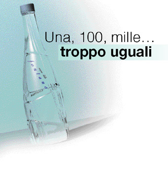
One, 100, thousand… all too much the same
Reflections of a designer involved in designing a mineral water container. After carrying out due market studies, it seems that at least in Italy the container of this precious item is fairly neglected and humiliated in its all too standard forms. Andrea Cacaci
How many mineral water springs exist in Italy? The list is long (around 300 brands traded*) but one has the impression that it is never really updated. Despite the high level of anthropization, in all areas a sufficiently large uncontaminated area can be located that enables the purification and the mineralization of water through natural filtering.
As laid down by law, waters that have their source in a subterranean deposit or layer, from one or more natural or perforated sources and that have special hygienic characteristics and health-giving properties (D.L. 25.1.1992, art. 1) are considered mineral waters. Nerea, Tinnea, Motette, Sveva, Primavera, Roana, that is each imaginative name conceals what is firstly a unique geological and secondly a historic and social situation, that as the case may be starts off from the Vulture massif, the Sibilline mountains or from the slopes of Mount Cucco.
Diuretic, curative with antioxidant effects, that is if not miraculous, legends and anecdotes have arisen around the water springs, that describe the purity and the richness of the water that flow from them. The selfsame Michelangelo recounts how he was cured from renal calculus drinking the waters of Fiuggi.
Bottles. What the
market offers
Considerations on materials
Mineral water is essentially bottled in containers made in three different materials: glass, plastic and polythened cardboard. Let’s immediately place cardboard and its paltry share of the market to one side, with its suffering from fundamental shortcoming: a lack of transparency. If for some products (milk being a blatant example), being able to view the product is not fundamental, in the case of mineral waters that have based their fortune on the exalting of concepts of being hygienic and the absence of impurities, being able to carry out a visual check is deemed fundamental. On this count, Purdy’s canned water deserves a brief special mention; here the advertising message gives us the measure of how the choice of the product is inseparably linked to a trend or fashion in consumption, almost becoming a status symbol.
Going back to the other two materials, the retail trade has had a decisive influence on the choice of type of container, orienting the market towards the use of plastic. In these last decades the share of glass has gone from 92% to 22% while plastic has shot up from 6.5% to 77%. The increase in plastic is aboveall to be put down to lesser transportation costs (an articulated lorry transports around 40% more water in plastic bottles compared to a load of glass bottles with their relative crates). Today studies tell us that the most striking forms of replacement depend on the type of plastic used, with an increase in PET containers to the detriment of PVC: This preference for PET seen against PVC, as well as for aesthetic (shininess and transparency) and practical advantages (greater toughness and gas permeability) is to be mainly associated with the reduction of the industrial costs in the production of PET. The decline in the use of PVC is also to be put down to environmental controversy surrounding its constituent monomer, the notorious sodium chloride.
Considerations on formats
The sizes of mineral water containers are essentially three: large (from 1.5 or two litres only in plastic), medium (from 3/4 to 1 litre mostly in glass) and small (0.5 litres, 1/4 or 33 cl, made in both materials). Due to the functional and economic gap with plastic, the use of glass is ever concentrating on sectors where image is of greater importance.
It is on the restaurant table, where the mineral water bottle has to face up to the noble wine container or the exuberant beer bottle, where glass wins its own personal battle against PET.
In theory, the material should only add surplus value and a shape that is “eloquent”; unfortunately glass if often forced to follow banal, homogeneous shapes, that do not transmit other concepts beyond “ I contain water”. Without hoping to equal the values of the legendary CocaCola bottle, certainly the mineral water bottle should (and could) communicate additional messages.
An event to be studied
Original and vivacious parallel worlds are being constructed around mineral water, phenomenon with an economic scope but with strong social significance,
In fact the number of shops that only sell mineral water are growing, in Paris in the Rue de Saint Honoré and in Rome at the Stazione Termini; courses are being organized for the training of “water tasters”; ice is extracted from the heart of icebergs in order to attain water of “paleozoic” purity; we discover that some Italian fashion designers such as Versace, Ferrè and Dolce & Gabbana are not beneath signing their names to trendy bottles; the most shrewd restauranteurs (and not only French ones) add mineral waters to their wine lists. Evermore often social events (fashion parades or the launch of new products) are sponsored by the producers of mineral waters, with free distribution of mineral water bottles (Ty-Nant at the head of the list). Even the Italian Ministry for Health has not wished to stay out of the proceedings, suggesting the use of small bottles in place of glasses at bar tables. Finally, the European Commission has decided to offer the possibility of subjecting the water to processing before being bottled, thus coming closer to the US and also opening the market to water from the public aqueducts. But if on the one hand the mineral water being traded comes under many brands, on the other hand it seems that all producers turn to the same designer (who normally does not express himself with great imagination) in creating the bottle. Italian mineral water bottles are all sadly highly similar. At the moment of translating the peculiarities of taste and composition of the water into image, the same going for their history, geography or the human aspects that feature in the same, one finds that, judging from the containers, Uliveto, Ferrarelle and Sangemini look much alike, in the same way as on the supermarket shelves Vera can be confused with Levissima or San Pellegrino with Norda. At this point the choice of the consumer appears difficult. Examining the label, that often appears abstruse if not illegible, few points remain to help one in ones choice, or that is what one remembers of the ads and ones daily habits. But it should be said that the advertising should be able to resort to something strong and “memorable” apart from the name of the product. The only persons that appear to be oblivious of these trends are designers. Only few are called upon to create new containers, and few of these have carried out their task to the full. To the forefront we find the omnivorous Philippe Starck, who redesigned the bottle for the Corsican spring St. Georges. The other international design star Ross Lovegrove didn’t want to miss out, having turned his ingeniousness creativity on the Ty Nant PET flacon. In Italy Giugiaro added some “drops” to the San Bernardo bottle and Pininfarina designed a quiet glass bottle for the Piemontese Lauretana.
And all of a sudden it seems a strange oversight that our designers have not been able to make the strong communicational value of the bottle emerge.
Being creative
Large, medium or small bottles in glass or plastic hence. A lead thread seems to bind them all together: the absence of a design project. Certainly they are all well resolved, they are “ergonomically” correct, the bottle-neck in PET bottles always starts in the right place, they are well balanced, and at times one even sees some formal-aesthetic flourish. But this is not enough to make them an integral part of a global communication project. A point is missing, something that gives the bottle character, the formal theme that focuses and represents the personality of the brand, the identification between container and contained. The club shape with wrinkled surface of the Chinotto San Pellegrino bottles “is” Chinotto San Pellegrino, simple and inimitable; in the same way there is an indissoluble symbiosis between the blue bottle of the Welsh water Ty Nant and its content, or the Verdicchio bottle of the Colli di Jesi. In all these cases the communication obtained with the shape is such as to make the presence of the label superfluous. It is also worthwhile citing cases of exaggeration as regards shape, as in the case of Voss water, where the quest for a special shape has thrust to the extremes, leading to the creation of something that resembles a perfume bottle. Or in the cases in which the water takes on the shape of spirits or wine bottle generating considerable confusion (Hildon). On the other side of things, example of the “sublime” disinterest for packaging, one has the advertising of Lete water in which, after the show put on by the sodium particle, there is a long shot of the label with the brand name in close up to the detriment of the bottle that is never seen in its entirety. A non chance partialisation, given that here in terms of the communication, the shape of the container – the packaging as such – is considered insignificant.
Uniformity: to be
avoided. How?
But what are the proposals in order to break this uniformity? Would the design of “alternative” bottles risk encountering production difficulties? And isn’t the lack of originality linked to purely economical questions?
To solve this doubt, let’s take a look at some practical cases that might throw light on the question.
• In France, with the complicity of relatively decent tap water and production in the hands of a few large groups, there is a tough competition between the various brands. The result is the market leaders have aimed at clearly diversifying their own personal image. One only need think of the enormous difference between the Badoit containers (leader in sparkling water) and Vittel (head of the “flat” waters), not to speak of the formal unity of Perrier or the elegance with which Evian has been able to interpret the theme of the ribbing (with bas relief outline of mountains), to end up with the special features of Valvert. It is evident that an aggressive market such as this one gives birth to examples like that of Saint Georges water. Despite a mainly regional distribution and with a broadscale retail distribution target, the small Corsican company has chosen to emphasise the uniqueness of its bottle. Solved what is more in an extremely simple manner: starting off from the recovery of the classic shape of the largescale bottle with vertical mirroring, concealing the horizontal ribbing under a slim label. The result is a container that stands out for its sobriety and elegance and that can compete with others in stiffness and lightness.
• Leaving the French market the Ty Nant PET bottle deserves a mention, the Welsh concern with a world distribution that has always aimed at the upper reaches of the market. In its debut in 89 it upturned the canons of color, presenting a blue bottle (whose shape although pleasant and well designed was not a new feature). In its venture with PET it had to forcefully underline its own uniqueness in the world market and it managed to do so with a bottle that is without equal.
• And in Italy? Naturally the Italians have also come up with some “pearls”, like the Courmayeur mineral water bottle, and the Nepi, Lilia or Sant’Anna bottles. These are concerns that have tried to build themselves a personal image beyond the usual with simple tools (use of different colors, special surface treatment). What though is still lacking all the same is the big brands’ drive towards an excellence of shape, something that could also drive the smaller concerns to seek an appeal which identifies them and makes them stand out in a sea of bottles that all look the same.
Andrea Cacaci
architetturaLABORATORIO, Industrial design studio that works in many merchandise sectors cooperating with concerns such as Artemide, Colombo Design, Panasonic, Ipe, Brasilia etc
|
|
Da mito a oggetto economico
Oggi, quella dell’acqua minerale, è diventata a tutti gli effetti un’importante "vicenda economica". Negli ultimi anni le acque minerali imbottigliate sono divenute un affare in continua crescita: nel 2001 in Italia si sono venduti quasi 10 miliardi di litri di minerale, più di 170 litri a testa, con fatturati complessivi che superano i 1.700 milioni di Euro.
Questi dati ci pongono in cima alla classifica mondiale dei consumatori di acque minerali, sorpassando Germania e la stessa Francia, considerata la patria della “minerale”. La sfiducia verso la comune acqua di rubinetto (vista, in alcuni casi a ragione, come facilmente soggetta a inquinamento) e la corsa generalizzata verso prodotti naturali, sono alla base di tale incremento. Non va tuttavia sottovalutato l’effetto poco razionale ma trascinante delle "bollicine", su cui l'acqua minerale ha costruito molto del proprio successo e del proprio "appeal".
Il mercato della minerale sta mostrando di essere così ricco da avere scatenato una reale "corsa alla fonte" da parte di alcuni grandi gruppi industriali. Pur essendo quasi 300 le acque commercializzate, più della metà della "torta" è in mano a 8 grandi aziende che, potendo contare su una diffusione nazionale grazie alla distribuzione organizzata, hanno assunto di fatto un ruolo egemonico. Importante e fondamentale in questo discorso è la presenza di capitali stranieri che controllano il nostro mercato: Nestlè (con i marchi San Pellegrino, Limpia, Levissima, Pracastello, Claudia, Vera, San Bernardo, Ulmeta, Lara, Pejo, Panna), Gerolsteiner (con 6 marchi), Danone (con i marchi Ferrarelle, Vitasnella, Boario, Sant’Agata, Natia).
Come in altri settori industriali, le aziende italiane si caratterizzano per una decisa "polverizzazione": se centinaia sono le fonti, quasi altrettante sono le aziende che le sfruttano. Cogedi (Rocchetta, Uliveto), San Benedetto (San Benedetto, Guizza, Acqua di Nepi) e Sangemini (Fabia, Fiuggi, Sangemini): si contano sulle dita di una mano le aziende nostrane che riescono a detenere fette di mercato di una certa rilevanza.
|
|
From myth to economic object
These days mineral water has to all effects become an important “economic question”. Over the latter years bottled mineral water has become a business that has been growing constantly: In Italy in 2001 close on 10 billion litres of mineral water were sold, more than 170 litres per capita, with overall turnover exceeding 1,700 million Euros. These figures place Italy at the top of the world rating of mineral water consumers, overtaking Germany and even France, considered the home of mineral water. The mistrust shown against tap water (justifiable in some cases seeing how easily pollution can occur) and the general rush to natural products are at the basis of this increase. However the non rational draw of the “bubbles”, on which mineral water has built most of its success and appeal, should not be underrated. The mineral water market is now proven to be so rich as to have unleashed a real “water spring rush” by the huge industrial groups. Although 300 or so mineral water names are traded, more than half of the “pie” is in the hands of eight large companies, that being able to count on national distribution thanks to the largescale retail trade, have in fact managed to hegemonize the situation: the presence of foreign capital that controls the Italian market is important on this count: Nestlé (with the San Pellegrino, Limpia, Levissima, Pracastello, Claudia, Vera, San Bernardo, Ulmeta, Lara, Pejo and Panna brands), Gerolsteiner (with 6 brands), and Danone (with the Ferrarelle, Vitasnella, Boario, Sant’Agata and Natia brands).
As in other industrial sectors, the Italian companies feature for their marked “pulverization”: If the water springs are in their hundreds, the same goes for the companies that exploit them. Cogedi (Rocchetta, Uliveto), San Benedetto (San Benedetto, Guizza, Acqua di Nepi) and Sangemini (Fabia, Fiuggi, Sangemini): the Italian concerns that have managed to hang on to a sizeable slice of the market are but few and far between.
|
|
|
|