


|
|

DETERGENZA Il confezionamento di prodotti detergenti per uso domestico consumati in Italia, comunità e catering compresi. L’analisi esclude i prodotti chimici destinati alla grande industria e all’agricoltura. La statistica sulle quantità consumate è elaborata sulla base dei dati Federchimica. I dati Istat supportano le cifre sul commercio estero. Plinio Iascone
Per svolgere con coerenza il tema assegnato, l’autrice della tesi, Benedetta Terenzi, ha approfondito gli aspetti generali riguardanti le nuove strategie per l’olio, la sua distribuzione legata alla tradizione e al territorio, la comunicazione, il packaging, la grafica pubblicitaria e l’allestimento promozionale: in una sorta di reazione a catena, spaziando in una multidisciplinarietà articolata, è arrivata a definire l’immagine coordinata del prodotto ipotizzato.
Conferendo a Terenzi l’argomento di tesi, il relatore aveva premesso che «in seno alla progettualità che siamo soliti definire come design for food, il lavoro deve puntare a valorizzare un particolare prodotto oleario, partendo dalla rivisitazione della sua confezione e concludendo con l’elaborazione dei provvedimenti di immagine necessari ad accompagnarlo sui mercati ad alto valore aggiunto».
L’intero progetto è stato costruito intorno alla conoscenza approfondita delle problematiche (storiche, agricole, di processo, di marketing) nonché alla finalizzazione del design entro gli ambiti del “made in Italy”, evidenziando al contempo i possibili ritorni economici di un’azione così complessa.
In altri termini, questo lavoro di tesi ha riguardato la realtà produttiva, specifica e qualificata della olivicoltura umbra (attestata da 2000 anni di storia), e ne ha enfatizzato le potenzialità.
A sostegno della specificità
Per evidenziarne le caratteristiche e collocarli sul mercato nel più garbato, elegante e convincente ma anche riconoscibile, il packaging da progettare doveva dunque sostenere la specificità del prodotto olio umbro.
Si è reso quindi necessario percorrere l’ipotesi della “monocolturalità” del prodotto, così come è già stato fatto da tempo con il vino e così come si fa già, in ogni caso, per la gran parte dei prodotti di origine riconosciuta, per accreditarli non solo come espressione della cultura locale ma anche come risultato di una tecnologia avanzata.
Nello svolgimento del progetto, l’ipotesi della produzione di oli monoculturali si è rivelata tanto stimolante da sembrare il vero punto di forza per il rilancio ipotizzato della produzione umbra rispetto alla pluralità di offerte, presenti sui mercati nazionali e internazionali.
Imballaggio: motore di interessi
La parte iniziale della tesi ha preso in esame l’oggettistica storica per l’olio e i suoi diversi utilizzi nel corso dei secoli: l’attività ha consentito di raccogliere una vasta documentazione che è stata spunto formale delle scelte progettuali successive.
Sempre seguendo le indicazioni del professor Ubertazzi, Benedetta Terenzi ha dunque lavorato per creare un progetto in grado di accreditare il prodotto sui mercati del mondo, evidenziandone, in forma riconoscibile, le caratteristiche di “italianità”. Il materiale con cui realizzare i nuovi flaconi è stato comunque ricondotto agli stilemi più emblematici della storia di questo prodotto: come noto, l’olio è sempre stato contenuto nel coccio, più o meno dotato di vetrinatura (“giara” in Sicilia, “orcio” in Umbria, Toscana e Liguria). L’obiettivo principale della tesi di Benedetta è stata, di conseguenza, la concezione di una famiglia di contenitori che si prestasse ad accreditare sul mercato le specifiche varietà olearie, secondo la più raffinata ipotesi culturale di un design che affonda le proprie radici nella storia: ne sono scaturiti dei contenitori concepiti non solo in termini di design ma anche di packaging for food .
D’altronde, come afferma Benedetta Terenzi «il destinatario di un progetto di packaging è lo stesso del progetto del designer: il consumatore, che sceglie i prodotti in base a processi di autoidentificazione». È subito evidente che, in questo senso, il packaging (l’“abito” del prodotto) può giocare un ruolo fondamentale creando, mutando o elevando l’immagine e l’immaginario del prodotto stesso. Se l’evoluzione dell’imballaggio alimentare è strettamente connessa ai cambiamenti di costume (e, viceversa, li influenza), la creatività è soltanto un aspetto del problema che, però, rimane sempre lo stesso: dare valore aggiunto all’offerta».
|
Nota - Il testo si basa sui risultati della tesi progettuale di Benedetta Terenzi (laureata con lode a novembre 2005 presso la Facoltà di Architettura del-l’Università degli Studi di Firenze) dal titolo “Umen: l’oro d’Umbria; sistema di contenitori per la valorizzazione degli oli monovarietali tradizionali”. La tesi è stata presentata dal professor Alessandro Ubertazzi, ordinario di Disegno Industriale.
Nel 2004, prima della laurea, la Terenzi ha ricevuto una “menzione d’onore” al Concorso di Idee sugli imballaggi cellulosici indetto dal Comieco e ha frequentato corsi di Envase y Emballage presso l’Università Politecnica di Valencia.
Occorre ricordare che, nella scelta delle tecnologie per la realizzazione dei flaconi concepiti, di grande aiuto è stata la consulenza fornita dalla vetreria AVIR SpA e dalla ditta Cerve (specializzata nelle rifiniture a e nella personalizzazione dei prodotti di vetro).
Note - The article is based on the results of the design thesis by Benedetta Terenzi (who attained her degree with full marks November 2005 at the Faculty of Architecture of the Università degli Studi, Florence) with the title “Umen: the gold of Umbria; system of containers for valorising traditional monovarietal oils”.
The thesis was presented by Alessandro Ubertazzi, professor of Industrial Design.
In 2004, before taking her degree, Terenzi received a “mention of honour” at the Competition for Ideas on cellulose packaging organized by Comieco and attended the courses of Envase y Emballage at the University Polytechnic of Valencia.
It should be stated that, in choosing the technology for the creation of the flacons made, the consultancy provided by the AVIR SpA glassworks, along with the company Cerve (specialised in the finishing and the personalisation of the glass products) was of great help.
|
|
|
 |

Design and the market
Design project for a “unique” oil
PACKAGING AND IMAGE A system of flacons and cases for presenting the main variety of oils, extracted from the single Umbrian cultivar: example of how design associated with such a circumscribed subject, can in actual fact lead to considerations of greater scope. The packaging has in fact been created following historic research and analysis of the area and of the strategies of traditional distribution, to reach the point of defining shape, graphics, coordinated image in support of the unique nature of the product. Alice Forasassi
In order to successfully tackle the subject set for her thesis, Benedetta Terenzi went into the general aspects concerning the new strategies for food oil, its distribution associated tradition and the territory, communication, packaging, advertising graphics and the establishing of promotional undertakings: in a sort of chain reaction featuring a multidisciplinary approach, Benedetta has successfully managed to define the coordinated image of the said product. Assigning Terenzi the subject of her thesis, her supervisor stated that «along with an approach to the project that we are used to defining as design for food, the work has to aim at valorising a special oil product, starting off from the redesign of its packaging and concluding with the devising of undertakings to promote its image accompanying the launch on the market of a high added value product».
The entire project entailed the gathering of knowledge and indepth study of the subject from the historical-, agricultural, processing and marketing side, leading to the design of a specifically Italian product, all this with an eye to the economic returns of the entire action.
In other words, the thesis covers the problems of Umbrian olive growing qualified as it is by 2000 years of history, highlighting the extraordinary potential of the same.
Supporting its specific nature
To highlight its characteristics and ensure its effective launch on the market while underlining elegance and refinement, the packaging to be designed has to embody the quintessential nature of Umbrian oil. Hence as was done time back for wine and as is the case for most products of a recognised origin, to credit the product on the markets of the world the monocultural approach was adopted, doing everything to emphasise the prevailing features of its Italianness. The material used to create the new flacons is emblematic of the history of this product: as is known oil has always been contained in jars, to a greater or lesser extend glazed (“giara” in Sicily, “orcio” in Umbria, Tuscany and Liguria).
The main objective of Benedetta’s thesis was consequently to conceive a family of containers to credit and enhance specific varieties of oil on the market, with a design steeped in the culture and the history of the product: the result not only features in terms of design but also as food packaging.
And in fact Benedetta Terenzi herself states «the addressee of the design project, the consumer, chooses the product on the basis of self-identification. Here packaging (“cladding” of the product) can play a strong role creating, transforming or raising the image and people’s imagination of the selfsame product. If the evolution of food packaging is strictly related to changes in custom (and, viceversa, its influence on the same), creativity is only part of the problem that, though is as ever the same: attributing added value to the product».
|
|
|
|
|
|
|
|

Prime ipotesi formali per la famiglia di flaconi
Gli oli monovarietali dovrebbero essere contenuti ciascuno in un tipo di flacone, caratterizzato dalla particolare sezione: si forma, così, una famiglia di contenitori (simili ma diversi nei vari formati), coordinati armonicamente fra loro (1, 2, 3, 4 e 5).
I flaconi
I flaconi per l’olio devono principalmente consentire che le caratteristiche organolettiche e sensoriali del prodotto si mantengano inalterate il più a lungo possibile. L’idea che ha accompagnato tutto il progetto è stata quella di riproporre contenitori di terracotta, un materiale che, da sempre, appartiene alla tradizione olearia.Dopo una ricerca che ha evidenziato la difficoltà di lavorare la terracotta in termini “industriali”, Benedetta Terenzi ha optato per una bottiglia di vetro che ricordasse quel materiale. Ecco perché ha scelto un vetro colorato in pasta e sabbiato all’esterno, che apparisse ruvido e più “caldo” del vetro normale.
I flaconi sono pensati per essere portati direttamente a tavola (a casa o nei ristoranti); essi saranno immediatamente riconoscibili per la forma, il colore e le scritte (in rilievo) che riportano il marchio “umen” e il nome della cultivar.
Le forme delle bottiglie per le singole cultivar sono costruite geometricamente in modo che si riconosca l’appartenenza a un sistema di forme che parta dalla sezione aurea e, più in generale, dalla magia dei numeri: passando per la costruzione kepleriana, il pentagono evolve nell’esagono e nell’ottagono mentre la perfezione del cerchio si moltiplica nelle forme lobate; il triangolo, la forma perfetta, si moltiplica in ognuna delle altre forme (6).
Le bottiglie hanno proporzioni studiate secondo rapporti matematici: partendo dalla figura perfetta del cerchio (che si ripete e interseca sé stesso) esse costituiscono una famiglia caratterizzata da nove diverse sezioni pure ed essenziali.
La sezione dei flaconi non cambia al variare della capacità; varia invece in modo proporzionale l’altezza. La bottiglia da 750 ml ricorda le proporzioni delle antiche ampolle porta-essenze; diminuendo l’altezza le proporzioni armoniche con cui sono progettate non cambiano. Le bottiglie hanno dimensioni variabili da 750 ml, 500 ml, 250 ml, fino a 100 ml (7, 8 e 9).
Le tavole iuguvine
Le tavole iuguvine (trovate circa 500 anni fa a Gubbio e alle quali Terenzi si è ispirata per disegnare il marchio degli oli umbri) sono state fuse nel bronzo, con l’evidente scopo di rendere indistruttibili alcuni testi sacri alle popolazioni etrusche. In verità, i testi sono ben più antichi delle tavole stesse, che costituiscono un documento importantissimo per la conoscenza dell’antico legame con i frutti della terra e gli animali. Curiosamente l’espressione umen (che ha la stessa radice del latino unguen, etimologicamente “ciò con cui si unge”) si trova ripetuta in vari passaggi del testo (10 e 11).
Le bottiglie hanno proporzioni studiate secondo rapporti matematici: partendo dalla figura perfetta del cerchio (che si ripete e interseca sé stesso) esse costituiscono una famiglia caratterizzata da nove diverse sezioni pure ed essenziali.
La sezione dei flaconi non cambia al variare della capacità; varia invece in modo proporzionale l’altezza. La bottiglia da 750 ml ricorda le proporzioni delle antiche ampolle porta-essenze; diminuendo l’altezza le proporzioni armoniche con cui sono progettate non cambiano. Le bottiglie hanno dimensioni variabili da 750 ml, 500 ml, 250 ml, fino a 100 ml (7, 8 e 9).
Umen
Marchio (che in realtà è un logo) ed etichetta (che rientrano nello studio di immagine coordinata) hanno voluto richiamare in primis la cultura del prodotto per poi, ricordarne le origini (12, 13, 14, 14a).
In particolare, il nuovo marchio coniuga appetibilità e naturalezza, tradizione e lavoro artigianale ma, allo stesso tempo, comunica il senso di contemporaneità e design. L’immagine pensata per l’olio monovarietale umbro
è caratterizzata da un lettering forte, desunto dalla radici storiche del luogo, depurato e semplificato per essere immediatamente percepito e riconoscibile.
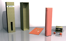
I flaconi con le loro confezioni
Le immagini 15, 16, 17 riportano rispettivamente il disegno tecnico per la realizzazione dell’astuccio (in cartone cannettato), il flacone per una singola varietà di olio con relativa confezione (contenente altresì il dosatore e un pieghevole) e una confezione multipla: le confezioni previste contengono uno, due o tre flaconi di varie dimensioni.
|
|
First formal hypotheses for the family of flacons
The monovarietal oils have to be each contained in a type of flacon, featuring a special section: thus constituting a family of containers (similar but different in their various formats), harmoniously coordinated with each other (1, 2, 3, 4 and 5).
The flacons
The principle purpose of the oil flacon is to ensure that the organoleptic and sensorial aspects of the product remain unchanged for as long as possible.
The idea that accompanied the entire projects was that of reproposing containers in terracotta, a material that has always been part of the oilmaking tradition. After a study that highlighted the difficulties of working terracotta in “industrial” terms, Benedetta Terenzi opted for a glass bottle resembling terracotta in its appearance. This is why she chose glass colored in the mix and sanded on the outside, that appears rougher and “warmer” than normal glass. The flacons have been conceived to be directly placed on the table (at home or in the restaurant); they are immediately recognisable in terms of shape, color and wording (in relief) and bear the brand “umen” and the name cultivar.
The shape of the bottle for the single cultivar has been geometrically constructed so that one recognises their belonging to a system of forms that start off from the golden section and more in general, from the magic of numbers: going by way of Kepler’s construction, the pentagon turns into a hexagon and then into an octagon while the perfection of the circle is multiplied in lobe forms; the triangle, the perfect shape, multiplies within all the other forms (6).
The bottles have proportions following mathematical ratios: starting off from the perfect figure of the circle (that repeats and intersects itself) they constitute a family featuring nine different pure and essential sections.
The section of the flacons does not change varying their capacity; what changes in proportion is the height. The 750 ml bottles follow the proportions of the ancient ampoules for containing essences; reducing their height the harmonic proportions of their design remain the same. The bottles are of sizes that vary from 750 ml, 500 ml, 250 ml, up to 100 ml (7, 8 and 9).
The Ugubine tables
The Ugubine tables (discovered around 500 years ago at Gubbio from which Terenzi has drawn her inspiration in designing the brand of the Umbrian oils) were cast in bronze, with the evident intent of making these scripts sacred to the Etruscan peoples indestructible.
In truth, the scripts are older than the tables themselves, that constitute an important document for the knowledge of the ancient bond with the fruits of the soil and the animals. Curiously, the expression umen (that has the same root as the Latin unguen, etimologically “that with which one oints oneself”) is repeated in various passages of the script (10 and 11).
Umen
Brand (that in actual fact is a logo) and label (that come under the study of coordinated image) first and foremost allude to the cultural background of the product, conjuring up its origins (12, 13, 14, 14a).
In particular the new brand combines taste with naturalness, tradition and craftwork while at the same time communicating an idea of contemporariness and design.
The image devised for Umbrian monovarietal oil features a strong lettering, drawing its historic roots from the area, though purified and simplified to make it immediately perceivable and recognisable.
The flacons with their packs
Pictures 15, 16, 17 respectively show the technical drawings for creating the case (in canneté cardboard), the flacons for the single varieties of oil with relative pack (also containing doser and brochure) and a multiple pack: the packs contain one, two or three flacons of different sizes. |
|
|
|
|
|
|
|
|
Note a margine
Il packaging oggi mostra di volersi evolvere all’interno della cultura del “design strategico”, per proporsi all’industria come un servizio integrato a lungo termine. Per introdurre sul mercato un prodotto completamente nuovo occorrono, infatti, investimenti cospicui finalizzati al “ritorno d’immagine” e il design strategico può agire utilmente per l’innovazione e il coordinamento dell’intero sistema-prodotto.
Intervistato nel corso della preparazione della tesi di laurea, Stefano Lavorini (oltre che giornalista, produttore di olio a livello amatoriale) ha puntato l’attenzione sulla necessità di sfuggire all’omologazione in termini di offerta ma anche di imballaggio, che grava sul comparto. «È necessario differenziare un prodotto rispetto alla generalità dell’offerta e l’idea di non puntare solo sull’indicazione geografica ma di selezionare l’olio in funzione del cultivar di provenienza può costituire un ulteriore elemento di comunicazione nei confronti dei consumatori. Il mercato, purtroppo, non sembra così evoluto e possiamo lamentare una certa mancanza di coscienza e conoscenza da parte degli acquirenti, che non percepiscono esattamente la differenza tra un “olio extra vergine” e un “olio di oliva”, e tendono peraltro a preferire prodotti un sapore standardizzato e costante nel tempo».
Consultato, al riguardo, anche Florio Terenzi (imprenditore, grande conoscitore di packaging e anch’egli produttore di olio e di vino) evidenzia molto chiaramente le problematiche legate attualmente a questo settore «Tutti noi, purtroppo, siamo condizionati dal mercato e, soprattutto, dalla Grande Distribuzione che opera in prevalenza sulla quantità». In realtà, oggi, la maggior parte dei prodotti alimentari sconta una notevole standardizzazione e l’olio non fa eccezione. Ma, in futuro, le cose potrebbero essere diverse, perché sarà la qualità a guidare le scelte, a partire da quelle degli agricoltori. In questo contesto, il contenitore ha un ruolo fondamentale, diventando l’elemento trainante di tutto il processo; le istituzioni, dal canto loro, dovrebbe promuovere e sostenere una “campagna” per certificare e garantire l’olio di produzione italiana».
|
|
Marginal notes
Packaging today wishes to evolve within the culture of “strategic design”, to offer itself to industry as a longterm integrated service. To introduce a completely new product on the market in fact conspicuous investments in terms of the “return on image” are required. Here strategic design can be useful in innovating and coordinating the entire product system.
Interviewed during the preparation of her degree thesis. Stefano Lavorini (as well as journalist, home grown oil producer) placed the onus on the need to avoid the homologation in terms of product offer but also in terms of packaging that currently governs the sector. «We need to make a product stand out from the general offer and the idea of not only merely aiming at the geographic indication but of selecting oil in terms of its cultivar of origin can lead to a further element of communication with the consumer. Unfortunately, the market is not that developed and the purchaser suffers from a certain lack of awareness and knowledge, finding it hard to perceive the exact difference between “extra virgin olive oil” and olive oil, what is more preferring products with a standardised taste that lasts in time».
Florio Terenzi (entrepreneur, with a great knowledge of packaging and he too an oil and wine producer) very clearly highlights the problems currently affecting the sector «All of us are unfortunately conditioned by the market and aboveall by broadscale distribution that mainly works in terms of quantity. In actual fact today most food products are considerably standardised and the same goes for oil. But in the future things could change, because it will be the quality that guides the choices made, starting off from the choices made by the farmers. In this context the container plays a fundamental role, becoming the driving force of the entire process; the institutions for their part should promote and support a “campaign” for certifying and guaranteeing Italian oil production». |
|
|
|