
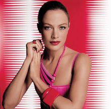
Chiusure silenziosissime, colori “assoluti”
o trasparenti, erogazioni mirate, sensazioni tattili speciali… Suggestioni sul packaging
(e non solo) da Marie-Rose Tricon, responsabile del Centro Europeo Sviluppo Prodotti di Estée Lauder.
Fino all’altro ieri il lusso era strillato: da cromie sfacciate, forme scioccanti e, soprattutto, griffe “sparate” in primo piano. Ovunque. Oggi invece tutto sfuma, affidato alla trasparenza di un bianco-non-bianco o alla matericità di una trama che si percepisce soltanto sulla pelle, scivolando sempre più verso quel particolare tipo di silenzio che solo gli intenditori sentono: lo stesso silenzio che si “fa” chiudendo la portiera di una Jaguar, o il cassetto di una cucina italiana di alta classe.
Così definisce il lusso la responsabile del Centro Europeo Sviluppo Prodotti Estée Lauder, Marie-Rose Tricon, cultrice della materia se non altro per il lavoro che svolge, dalla capitale parigina, per una casa che nell’alto di gamma colloca il proprio core business e la propria identità.
Ma, urlate o meno, le varie “forme” del lusso sembrano avere in comune una cosa: la tensione verso la perfezione, declinazione dell’assoluto. È qui che si scorge il nesso fra il cosmetico destinato alla donna matura e quello per la ragazza sensibile al bello; fra i prodotti ispirati a un Giappone silente e misterioso e quelli che evocano i colori e i ritmi sfrenati dell’America Latina.
In questo luogo ideale e fisico si è costruita - con un costante lavoro di ricerca e di innovazione, che molto deve alla cultura e altrettanto alla tecnologia - l’immagine di Estée Lauder. Il packaging ne è uno dei veicoli privilegiati, e Madame Tricon ci regala qualche suggestione sulle strade che il processo creativo percorre per arrivare a formulare un prodotto (e il suo aspetto) a marchio Estée. Eccole, riorganizzate per temi e capitoli, ed esposte da un “Io narrante”.
Ispirazione 1 (la natura)
L’ispirazione può arrivare da qualunque cosa e in qualsiasi momento… anche mentre camminiamo. Dalla natura, per esempio. Per la linea di make-up “Pure Eden”, che abbiamo lanciato l’anno scorso, ci siamo lasciati suggestionare da quella sensazione particolarissima che proviamo solo a primavera, camminando a piedi nudi sull’erba. Abbiamo cercato di cogliere il colore di quest’erba e di ricrearlo sul packaging integrando nel vasetto cubico (dunque nella fase di stampaggio) una lamina di verde che crea un effetto visivo molto naturale, appunto, oltre che curioso e originale. Per evocare la luce della brina abbiamo invece lavorato sulla texture del prodotto, ottenendo un effetto cangiante e perlato, candido e naif, che caratterizza l’intera linea di make-up e la “narrazione” che la ispira.
Ispirazione 2 (la cultura)
Anche la cultura è fonte continua di idee e impressioni. Per la prossima Collezione Primavera di make-up, per esempio, ci siamo ispirati al concetto dell’essere stravagante e a un’estetica orientaleggiante da cui è nata, fra l’altro, la forma di alcune matite da trucco che ricordano i bastoncini da riso cinesi. Ma non c’è solo l’Oriente, con le suggestioni delle tradizioni più antiche e con la straordinaria libertà creativa espressa dai gruppi giovanili di oggi. Il mondo sta risentendo molto dell’influenza del Sud America, delle sue danze e dello spirito festoso: è un’influenza che si farà sempre più sensibile, soprattutto durante l’estate che ne esalterà i colori vivaci e in particolare quel suo rosso fuoco che sa di samba e di salsa, e che darà vita a uno dei nostri prossimi rossetti. Fuori dal folclore, comunque, “cultura” è anche l’architettura “alta” di Le Corbusier e Wright, o il grande design internazionale Art Déco e Futurista. Sono all’origine di alcune nuove creazioni, che abbiamo concepito come “oggetti di desiderio”. E sarà, ancora una volta, un rossetto a beneficiarne.
Cosa piace ai giovani
Contando sulla proverbiale fedeltà del cliente Estée Lauder, uno degli obiettivi privilegiati dei marketer della società sono i giovani, in quanto probabili consumatori “per sempre”. I creativi delle varie linee di prodotto, quindi, e in particolare di profumi e make up, mettono in campo azioni mirate. In che modo? Con prodotti giovani, ovviamente, di cui il recente Pure Color Lip Vinyl Gloss in vasetto rappresenta un buon esempio. Più in generale, gli ombretti e i rossetti dai colori assoluti, così come le formulazioni in crema, hanno centrato pienamente questo target. Se, infatti, una donna di cinquanta-sessant’anni preferirà senz’altro un prodotto con applicatore, la ragazza può apprezzare la più giocosa e anticonformista crema in cui infilare le dita.
Assenze
Il fascino tutt’ora esercitato dalle trasparenze e dal carattere di assoluta purezza che conferiscono a un prodotto, ha stimolato l’adozione di particolari tecnologie di estrusione che permettono di giocare, con effetti inediti, sulla combinazione di “assenza” di colore e fisicità dei materiali.
Suo naturale contraltare è l’esaltazione delle sensazioni trasmesse dalla materia e dalle sue cromie, anch’esse sottolineate impiegando opportune tecniche di stratificazione del packaging. In uno dei nostri prossimi rossetti, per esempio, si scorgerà dell’oro sotto al blu marino della confezione, che ne illuminerà il “buio” con un riflesso di luce dall’interno.
Infine, ancora una considerazione sul tema iniziale del silenzio: quando chiudiamo un rossetto di lusso, lo scatto avrà un rumore inequivocabile. Lo stesso vale per i compatti, dove il prodotto Estée Lauder ha un “suono” ben preciso e per i quali stiamo infatti adottando delle nuove chiusure magnetiche, non a scatto.
Effetti tattili ed erogazioni mirate
Oggi, dunque, il lusso si “sente” di meno con gli occhi e di più con le orecchie e con il tatto, allo stesso modo come si “riconosce” il cashmere o uno scialle in pashmena. Per questo è diventata sempre più importante, accanto alla forma e al colore, anche la sensazione trasmessa dalla superficie sontuosamente morbida (o al contrario algida e adamantina) di una confezione. Così, per ottenere nuovi effetti di trasparenza abbiamo fatto largo uso di PMA (polimetalacrilato), mentre la “morbidezza” dei prodotti è stata aumentata dall’aggiunta di silicone…
Ma attenzione a non trascurare le funzioni d’uso: per l’immagine di marca il packaging più bello diventa un boomerang dagli effetti devastanti se… il prodotto non esce. In altre parole, qualsiasi tipo di dispenser richiede che si attivi la pompetta, schiacciando più volte per far uscire l’aria e poter “pescare” il fluido; ma dopo questa prima volta, l’erogazione deve essere immediata. Sviluppando liberamente il tema, stiamo lavorando sulla nebulizzazione delle fragranze che, a seconda del prodotto, dovrà essere “libera e selvaggia” oppure assolutamente precisa. Inoltre dobbiamo poter stabilire con la massima esattezza il quantitativo di prodotto - e talvolta anche la forma - di volta in volta dispensato, perché si tratta di fattori che influenzano largamente la percezione. Di più, se il foro dell’erogatore è molto stretto ne uscirà una crema “a spaghetto”, mentre un’esperienza tutt’affatto differente sarà generata da un fiotto più ampio e morbido di sostanza. Anche in questo caso non possiamo stabilire a priori quale sia “la cosa giusta” ma solo ciò che è più coerente con l’identità complessiva di un prodotto; è evidente, però, che la stessa formula o il medesimo tubetto possono trasmettere sensazioni diverse a seconda del diametro che avrà l’imboccatura del tubetto.
È chiaro, ora, qual è la “cura del dettaglio” che fa la differenza?
|
|
The sound of luxury
Noiseless fastenings, “sheer” or transparent colors, purpose-designed dispensers, special tactile sensations…
Ideas on packaging (and other things too) by Marie-Rose Tricon, head of Estée Lauder’s European Product Development Center.
Until not so long ago luxury was loud: brazen colors, outrageous looks and, above all, “in your face” designer labels. Everywhere. Now, however, everything is toned down, left to the translucence of a white-not-white or the materialness of a texture which can only be perceived on the skin, increasingly drifting towards that particular type of silence which only connoisseurs can hear: the same silence which is “made” closing the door of a Jaguar, or the drawer of a high class Italian kitchen unit.
This is how the head of the Estée Lauder European Center for Product Development, Marie-Rose Tricon, an expert on the subject not least due to her job, defines luxury. She is based in Paris and works for a company which positions its core business and identity at the top of the range.
But, whether loud or not, the various forms of luxury seem to have one thing in common: the tendency towards perfection, an absolute declination. This is where we glimpse the connection between cosmetics intended for the mature woman and those for the young girl who is sensitive to beauty; among products inspired by a silent and mysterious Japan and those which evoke the exuberant colors and rhythms of Latin America.
The image of Estée Lauder was created in this ideal and physical place through constant research and innovation, owing a great deal to culture and just as much to technology. Packaging is one of its special mediums and Madame Tricon gives us some ideas on roads the creative process travels in order to achieve the formulation of a product (or its look) trademarked Estée. Here they are, organized by subject and article, and set forth by a “first person narrator”.
Inspiration 1 (nature)
Inspiration can be drawn from anything at any time.. even while out walking. From nature, for example. For the “Pure Eden” make up line, which we launched last year, we let ourselves be influenced by that very special sensation you feel only in Spring, walking barefoot on the grass. We tried to capture the color of the grass and recreate it on packaging by adding a sheet of green which creates a visual effect that is natural and curious and original, to the cubic jar (this is done at the moulding stage). To evoke the light of the frost we instead worked on the texture of the product, obtaining a iridescent and pearly, lily-white and naïf effect which characterizes the entire range of make-up and the “tale” which inspires it.
Inspiration 2 (culture)
Culture too is a continual source of ideas and impressions. For the next make-up Spring Collection, for instance, we were inspired by the concept of bizarreness and oriental aesthetics which generated, among other things, the shape of some make up pencils which recall Chinese chopsticks. But there is not just the Orient, with its ancient traditions and the extraordinary creative freedom expressed by today’s youth groups. The world is experiencing a great deal of influence from South America, its dancing and festive spirit. This influence which will be increasingly felt, above all in Summer, which will enhance its bright colors, especially that fiery red reminiscent of the samba and the salsa, and which will generate one of our forthcoming lipsticks.
Aside from folklore, however, “culture” is also the “tall” architecture of Le Corbusier and Wright, or great international Art Deco and Futuristic design. They are the source of some new creations, which we have conceived as “objects of desire”. And once more it will be a lipstick that reaps the benefits.
What young people like
Counting on the proverbial loyalty of Estée Lauder customers, one of the company’s favored marketing targets is young people, as they are likely to remain customers “forever”. Therefore, creative designers of various product ranges, especially perfumes and make-up, are launching special offensives.
How? Obviously with youthful products - a good example of which is the recent Pure Color Lip Vinyl Gloss in small jars. More broadly speaking, sheer color eye-shadows and lipsticks, like creams, have hit the target. In fact, while a woman of fifty or sixty will definitely prefer a product with an applicator, a young girl might appreciate the more playful and unconventional cream she can poke her finger in.
Absences
The lasting allure of transparence and the idea of absolutely purity it bestows on a product, has stimulated the adoption of particular extrusion technologies which allow us to play, with previously unseen effects, on the combination of “absence” of color and the physicalness of materials.
Its natural foil is the exaltation of the sensations transmitted by the material and its chromatisms, themselves emphasized by suitable techniques of packaging stratification. In one of our forthcoming lipsticks for example there is a glimpse of gold beneath the navy blue of the wrapping, which will light up the “darkness” with a reflection of light from within.
Finally, yet another consideration on the initial theme of silence: when we close a luxury lipstick, we plainly hear a click. The same goes for compacts, where the Estée Lauder product makes a unique sound. Here we are, in fact, introducing new magnetic fastenings which do not click shut.
Tactile effects and targeted dispensers
Nowadays then, luxury is sensed less with the eyes and more with the ears and touch, just as we recognize cashmere or pashmina shawls. This is why, as well as shape and color, the sensation transmitted by the sumptuously soft (or, on the contrary, cold and adamantine) surface of the packaging has become increasingly important. So, to achieve new transparent effects we have made much use of PMA (polymethacrylates) while the products’ “softness” has been increased by the addition of silicon…
But beware of neglecting the practical side: for brand image the most stunning packaging can turn into a boomerang with devastating consequences if… The product won’t come out. In other words, any type of dispenser requires pump action, pressing down a few times to expel air and draw up for the fluid: but after the first try, the product must come out at once. Liberally developing this theme, we are working on the atomization of fragrances which, depending on the product, should be “free and wild” or totally fastidious.
Moreover, we have to be able to establish, with the utmost precision, the quantity of the product - and sometimes the form too - which is dispensed each time, as these are factors which have a huge influence on our perception. If the hole of the dispenser is very small, a “string-like” cream will emerge, while a totally different effect will be obtained by a more ample and softer jet.
In this case too we cannot establish a priori what “the right thing” is but only what is most coherent with a product’s global identity. It is clear, however, that the same formula or the same tube can transmit different sensations depending on the diameter of the mouth of the tube.
Is it now clear which “concern for detail” will make the difference?
|