|
|
 |
I vincitori del 2003 e le anticipazioni sui temi da sviluppare per l'edizione 2004 dell'Oscar dell'imballaggio, per la quale "tecnologia e creatività" dovranno fare rima con "ambiente". L.G.
Milano, 8 Maggio 2003 - Palazzo della Triennale, luogo d'arte, design e cultura. Soprattutto luogo di ricordi e testimonianze di ingegno che assumono forma fisica e duratura, ma anche di segni del tempo destinati a essere ricordati, valorizzati nella loro essenza estetica e funzionale.
Ottima scelta, dunque, quella fatta dall'Istituto Italiano Imballaggio, che quest'anno ha accolto i vincitori dell'Oscar 2003 nel salone d'onore della Triennale, reso meno austero dalla rumorosa presenza degli invitati scampati a uno scroscio di pioggia violento e (per fortuna) breve. Riflettori puntati sui packaging che, secondo la giuria di esperti chiamati a giudicarli, meglio hanno interpretato il tema della comunicazione, sostenendo il prodotto con un'immagine adeguata e (non dimentichiamolo) con una tecnologia di prim'ordine.
Premiati di oggi e di domani - Ma prima di passare in rassegna i sei vincitori di quest'anno, è doveroso ricordare che l'Oscar 2004 verrà assegnato a quelle soluzioni di packaging e a quei sistemi di imballaggio pensati, fin dalle fasi di progettazione, per ridurre l’impatto ambientale. Riassunti dal Presidente di Conai Gianfranco Faina, ecco alcuni dei requisiti che i futuri "concorrenti" dovranno a vario titolo rispettare per poter entrare in competizione: risparmio di materia prima, ottimizzazione della fase di trasporto, facilitazione della raccolta differenziata e della valorizzazione, impiego di materiale riciclato. Come tradizione, anche l'anno prossimo, verranno comunque attribuiti premi speciali per comunicazione, tecnologia e contenuto di servizio.
|
|
Communicating the Oscar
Winners of the 2003 edition and a preview of the topics to be developed for the 2004 edition of the packaging Oscar, where "technology and creativity" go hand in hand with "environment". L.G.
28 May 2003, Milan - Palazzo della Triennale, quintessential structure for celebrating art, design and culture. Essentially a place where memories and testimonies to ingenuity take on a lasting physical form, but also where the signs of the times are destined to be remembered and admired for their functional and visual qualities.
The Italian Packaging Institute made an excellent choice this year in receiving the winners of the Oscar 2003 in the magnificent "hall of honor" in the Triennale, made somewhat less imposing by the boisterous crowd of guests taking cover from a powerful (but thankfully brief) downpour of rain.
All eyes were on the packaging. A panel of experts were invited to select the examples that best interpreted the idea of communication, lending the product an appropriate image while using (let's not forget) cutting-edge technology.
Award winners of today and tomorrow - But before reviewing this year's six prize winners, we should remember that the Oscar 2004 will be awarded to packaging ideas and other packaging systems conceived from the early phases of their design to reduce to a minimum the environmental impact. As concisely summed up by CONAI president, Gianfranco Faina, here are some of the prerequisites that future "contenders" will have to keep to in order to participate in the competition: conservation of raw materials, optimization of transportation phases, facilitation of segregated collection polices, and enhancement and use of recycled materials. As per tradition, next year will also see special prizes awarded to packaging featuring exceptional communication, technology and service content.
|
|
|
|
|
|
|
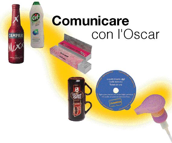
Alimentari e bevande
Campari mixx
Realizzato da Finpac per Gruppo Campari
Motivazione della giuria
La bottiglietta con lo sleeve è stata ritenuta semplice e comunicativa. L’immagine è fresca e giovane, come il prodotto che contiene.
Immagine e igiene a 360°
Il Gruppo Campari ha ricercato una modalità di packaging innovativa e d'impatto, in linea con le caratteristiche di Campari Mixx, ultimo nato in azienda, che ha decretato l’ingresso del Gruppo nella nascente categoria dei Ready To Drink in Italia.
È stato quindi approntato da Finpac uno sleeve unico a totale copertura della bottiglia, compreso il tappo a corona, primo nel suo genere in Europa. Il risultato si misura pertanto sia in termini di immagine sia in termini di qualità e igiene. Da un lato, infatti, l’unicità e l’originalità estetica (il rosso metallizzato e le due “x” della firma di Campari Mixx si impongono con un effetto trascinante) denotano e connotano il prodotto, rinforzando la comunicazione verso il target di riferimento, giovane e trendy, conferendo al contempo l’assoluta riconoscibilità alla confezione sul punto vendita. Dall'altro, la realizzazione dello sleeve a copertura totale ha permesso di offrire un plus unico per il consumatore: la salvaguardia totale dell’igiene al momento dell’utilizzo. Così come concepito, infatti, il packaging della bevanda da consumarsi rigorosamente dalla bottiglia, permette di “sfogliare” il rivestimento superiore in modo semplice e rapido, regalando un momento di gusto e di piacevole modalità di consumo, con l'importante vantaggio della massima garanzia d'igiene. Una nota particolare al colore dello sleeve (realizzato in PET 50 micron termoretraibile), frutto della riuscita sovrapposizione di più strati di diversi inchiostri, che ha permesso di ottenere il colore rosso distintivo del packaging, creando al contempo l’effetto metallizzato.
Ancora una volta, dunque, il Gruppo Campari conferma la propria attenzione al consumatore e all’immagine, grazie a un binomio perfetto.
Le aziende che hanno collaborato al progetto e alla realizzazione del pack: Gruppo Campari, Finpac per la realizzazione tecnica; D’Adda, Lorenzini, Vigorelli, BBDO per la creatività della grafica; Fuji per il materiale PET.
Prodotti chimici e per
la casa
CIF
Progettato e utilizzato da Lever Fabergé Italia
Agenzia Holmes & Marchant International Jon Davies – Creative Director
Produttore del flacone: Alpla -Werke
Produttore della capsula: Taplast
Motivazione della giuria - Interessante restyling per il flacone di CIF, nella cui progettazione si è tenuto conto anche dell’impatto ambientale, con la riduzione significativa del peso a parità di capacità del flacone.
Restyling di sostanza per CIF Crema
La nuova confezione di CIF Crema è il frutto della collaborazione fra le competenze tecniche espresse dal reparto Packaging del Global Technology Center di Lever Fabergé Italia di Casalpusterlengo e la creatività di un’agenzia esterna (la britannica Holmes & Marchant International). Il risultato è un packaging dal design moderno e nuovo, con un forte orientamento alle forme del personal care piuttosto che a quelle dei liquidi abrasivi per la pulizia della casa. Il punto di partenza erano i vecchi flaconi, studiati e dimensionati nel passato in modo da ovviare alle problematiche di riempimento di una formulazione che generava molta schiuma.
Tuttavia, grazie alle tecniche di riempimento attuali (che riducono al minimo questo specifico inconveniente) e al ricorso ai sistemi di progettazione CAD, è stato possibile ottimizzare il volume interno delle bottiglie, generando contenitori caratterizzati da minor impiego di materiali polimerici. Forti dunque i risparmi ottenuti, a livello economico e a tutto vantaggio dell'ambiente. Se confrontiamo infatti i contenitori vecchi e nuovi da 750 ml, il risparmio effettivo di materiale si aggira intorno ai 10 g per flacone e, a livello globale, Lever Fabergé può contare ora su circa 500 t/anno di polimero “risparmiato”. Da ultimo, ricordiamo l'intervento sul tappo, dimensionato in modo da essere il più possibile "antigoccia", così da rimanere sempre pulito; l’accoppiamento con il flacone è stato progettato in modo da facilitarne l'asportazione con una rotazione, consentendo alla massaia di svuotare completamente la bottiglia.
Prodotti farmaceutici, cosmetici
e per l’igiene personale
Roberto Cavalli Eau De Parfum
Progettato e realizzato da Cartografica Pusterla per I.T.F.
Motivazione della giuria - Apprezzato per la grafica accattivante e per la coerenza con il flacone contenuto e con l’immagine della griffe.
Griffe da ri-usare
Doveva essere "un oggetto pensato per essere conservato, in grado di completare con coerenza l'immagine del profumo della maison e di delineare con precisione l'identità fantasiosa e provocatoria dei prodotti Cavalli". Questo il brief interpretato da Cartografica Pusterla nel realizzare l'imballaggio di presentazione per il nuovo profumo firmato Roberto Cavalli.
La soluzione proposta - un cofanetto che ricalca forme estremamente tradizionali e quindi familiari - a un esame attento rivela di contro una certa complessità e, una volta svuotato dal contenuto, "vive" di vita propria come contenitore riutilizzabile, facilitato in questo dalla tenuta della chiusura, assicurata dagli spigoli del coperchio che si incastrano all'interno del fondo.
I materiali, impiegati in diverse tonalità e con texture di argento, contribuiscono a esaltare le caratteristiche del prodotto:
- la guaina esterna, realizzata con un cartoncino a base argento metallizzato cangiante, stampata in offset e con successiva impressione a caldo, avvolge il prodotto e contiene tutte le indicazioni di tipo tecnico e legale, oltre a richiamare l'attenzione con una grafica immediatamente riconducibile alla griffe;
- il cofanetto interno, per contrasto, è molto semplice e il coperchio è reso riconoscibile da un materiale argentato (tessuto non tessuto Tyvek by Du Pont) inusuale per questo genere di applicazioni e non immediatamente riconoscibile.
Un termoformato floccato, all'interno del cofanetto, accoglie e protegge il prezioso flacone, finemente decorato.
Una volta svuotato del profumo e del termoformato, il cofanetto può diventare un contenitore per i piccoli oggetti di cui ognuno di noi si circonda, ottenendo due risultati significativi: il riutilizzo di una parte dell'imballo e la permanenza del marchio Cavalli presso l'utilizzatore finale.
Prodotti da regalo e ricorrenza
Pocket Coffee Collection Cup
Progettato e utilizzato da Ferrero
Realizzato da Bormioli Rocco
Motivazione della giuria
Originale prodotto da regalo che rievoca – nella forma e nel colore – la caffettiera napoletana.
Pocket Coffee in caffettiera
La confezione, studiata da Ferrero, si pone come obiettivo primario la comunicazione immediata del legame della marca commercializzata (Pocket Coffee) con la merceologia (caffè) attraverso la forma dell'imballaggio, che ricorda inequivocabilmente la tradizionale caffettiera napoletana.
Le praline sono protette da astucci (che contengono 5 pezzi), realizzati in cartotecnica e film di polipropilene con chiusura termosaldata a busta, la cui apertura viene garantita da una banda di strappo.
Gli astucci vengono dunque inseriti nella confezione, costituita da due tazze di vetro sovrapposte e centrate tramite un anello di plastica, in grado di assicurare il facile l'assemblaggio dei pezzi, evitando al contempo possibili pericolose abrasioni a danno dei consumatori.
Le tazze sono corredate di due etichette di polipropilene che, oltre a garantire l'inviolabilità testimoniando i tentativi di manomissione, veicolano al consumatore la comunicazione sugli ingredienti e i plus del riutilizzo degli oggetti di vetro. I preziosi materiali impiegati e la cura nella realizzazione fanno di questa confezione un oggetto destinato al regalo e alla ricorrenza.
La pralina Pocket Coffee è, da sempre, destinata a un pubblico adulto; di conseguenza le forme e la grafica della confezione rispondono ai requisiti di eleganza e sobrietà necessari a soddisfare questo target.
Contenuto di servizio
Safe Disc Label
Prodotto da Pizzo Etichette per Blockbuster Italia
Motivazione della giuria
Doppiamente utile l’etichetta protettiva per DVD da noleggio. Preserva integro il prodotto che arriva a molti consumatori e completa correttamente il packaging e l’immagine del noleggiatore.
Proteggere con l’etichetta
Safe Disc Label è uno degli ultimi prodotti ideato, progettato, prodotto ed immesso sul mercato dalla Pizzo Etichette su richiesta di uno dei suoi migliori ed ormai fidelizzati clienti, quale: Blockbuster Italia.
Non si tratta di una semplice etichetta autoadesiva, ma di una vera e propria protezione per tutti i DVD/CD. L’esigenza della Blockbuster Italia è nata nel voler arginare e prevenire il problema della presenza dei graffi sui loro DVD, generati semplicemente da un trattamento poco ortodosso da parte della clientela in genere. Essendo il formato DVD particolarmente delicato rispetto alla videocassetta, la presenza di graffi e rigature compromettono la qualità dell’immagine, causando gravi danni anche economici all’azienda. Grazie ad un serio lavoro tra lo staff della Pizzo Etichette e lo staff della Blockbuster Italia è stato ideato: Safe Disc Label, progettato in tempi brevissimi e totalmente rispondente alle necessità del cliente, tale da poter essere applicato su ogni singolo DVD noleggiato. Blockbuster Italia, da circa un anno, in seguito all'esplosione del formato DVD, ha strategicamente modificato le proprie politiche commerciali confermandosi leader incontrastato nel mercato anche nel noleggio di questo formato.
Il cliente è continuamente informato in merito all’utilizzo della protezione del DVD grazie ad una comunicazione diretta sul punto vendita. La stessa viene recepita con assoluto entusiasmo.
Tecnologia
Nuvola
Progettato e prodotto da Taplast
Motivazione della giuria
Interessante mix di estetica e tecnologia, la pompetta interamente in plastica eroga soffice schiuma con una semplice pressione.
Vitalità e colore per il foamer riciclabile
Le ricerche di mercato indicano che il consumatore sta privilegiando tutti gli aspetti sensoriali dell’erogazione del prodotto in schiuma, che evoca sensazioni morbide, di “coccole” e di cura della pelle, e si può estendere a tutti i prodotti, anche per la casa. Di qui l’ultima innovazione di Taplast, che amplia la gamma delle All Plastic Pumps, già note in tutto il mondo.
Si chiama Nuvola ed è il primo foamer riciclabile al 100%, ovvero completamente realizzato con poliolefine e quindi smaltibile - assieme al flacone - nei cassonetti per il recupero del polietilene.
Il soffietto esterno di plastica, caratteristico di tutti i dispenser Taplast, nonché i molteplici abbinamenti di colore dei componenti, accentuano l’immagine e creano continuità alla linea All Plastic Pump Lotion. Grazie a ciò, Nuvola conferisce un’ondata di vitalità e colore al prodotto esposto sullo scaffale del punto vendita.
Ma, oltre ai plus in termini di immagine e distintività, Nuvola vanta altri vantaggi, di ordine tecnologico e funzionale. Innanzitutto non richiede flaconi dal collo speciale bensì standard (diametro SP28/410); inoltre non impone modifiche alle attuali linee di riempimento, e può erogare qualsiasi tipo di liquido, anche corrosivo, in quanto privo di parti in metallo. Infine, le sue dimensioni sono ridotte rispetto agli attuali standard di mercato, in quanto la sua camera di compressione è esterna: dunque, a parità di dose erogata, l’ingombro è inferiore. Ma non basta: è leggerissimo!
|
|
Food products and beverages
Campari mixx
Realized by Finpac for Gruppo Campari
Motivation of the jury
The bottle with sleeve was considered simple and communicative. A fresh, young image, like the product it contains.
Total image and hygiene
The Campari Group has adopted an innovative, high impact packaging method, in line with the characteristics of Campari Mixx, its latest product, which marks the Group's entrance in the growing Ready To Drink category in Italy.
A special sleeve has been developed by Finpac that completely covers the bottle, including the crown top, the first of its kind in Europe. The result is therefore one of both image and of quality and hygiene. In fact, the unique, original aesthetics (metallic red and the double “x” of the Campari Mixx brand for a completely distinctive look) denote and connate the product, strengthening the message for the target, young and trendy, while at the same time making the pack highly visible and unmistakable on the shelf.
The creation of this total sleeve also offers a unique advantage for the consumer: total guarantee of hygiene at the moment of use. In fact, as conceived, the packaging of this drink (to be consumed straight from the bottle) lets one “peel off” the top cover simply and quickly, for a moment full of taste and a satisfying method of consumption, plus the important advantage of guaranteed max hygiene.
The colour of the sleeve (50 micron heatshrink PET) deserves special mention: this is the result of clever superimposing of several layers of ink to get the distinctive red of this packaging, at the same time creating a metallic effect.
Once again, therefore, the Campari Group has confirmed its consumer and image orientation, thanks to this perfect combination.
The companies involved in the design and production of this pack: the Campari Group, Finpac (technical production); D’Adda, Lorenzini, Vigorelli, BBDO (creative graphics); Fuji (PET).
Household products
Cif
Designed e used by Lever Fabergé Italia
Agency Holmes & Marchant International Jon Davies - Creative Director
Bottle producer: Alpla - Werke
Capsule producer: Taplast
Motivation of the jury
Interesting restyling for the CIF flacon, the design also taking into account environmental impact, with an important reduction of weight while providing the same capacity.
Radical restyling for CIF Crema
The new CIF Crema pack is the outcome of cooperation between technical expertise of the Packaging Division at the Global Technology Center of Lever Fabergé Italia and the creativity of an external agency (Holmes & Marchant International of the UK). The result is a packaging with a new, modern design, a strong orientation for the forms used for personal care products rather than those used for abrasive liquids for cleaning the home.
The old flacons were used as the starting point: these had been carefully studied and sized in the past to avoid the problems of filling them with a formula that tended to create a lot of foam. Now, thanks to current filling techniques (that minimise this particular problem) and CAD design systems, it's possible to optimise the internal volume of the bottles, to create containers requiring less use of polymer materials.
Great economic savings, therefore, not to mention the advantages for the environment. In fact, if one compares the old 750 ml containers with the new ones, there's an effective saving in material of about 10 g per flacon and, on a global level, Lever Fabergé can now save some 500 tons of polymer each year.
Last but not least, the top has been redesigned to be more "non-drip" and so stay clean; its coupling with the flacon has been designed to make it easier to remove by twisting, letting the housewife empty the bottle completely.
Pharmaceuticals, cosmetics and
personal hygiene products
Roberto Cavalli Eau De Parfum
Designed and realized by Cartografica Pusterla for I.T.F.
Motivation of the jury
Appreciated for its appealing graphics and for the coherence with the flacon contained in the griffe.
Re-useable griffes
It was intended to be "an object conceived to be kept, to complete the image of this brand of perfume and to give precise shape to the fantastic and provocative image of Cavalli products". This was the brief for Cartografica Pusterla, asked to produce the presentation packaging for the new perfume from Roberto Cavalli.
The solution - a casket of highly traditional shape and thus familiar to all - reveals a certain complexity when looked at closer and, once emptied of its contents, it "lives" a life of its own as a re-useable container. The closure is very important here: guaranteed by the corners of the lid that fit neatly inside the base.
The materials used - in different tones with a silvery texture - help enhance the characteristics of the product:
- the external shell is made from glittery metallic silver board, offset printed and then hot blocked, wrapping the product and containing all the technical and legally required data, as well as attracting ones attention with graphics immediately typical of the griffe;
- the internal casket, on the other hand, is very simple and the cover is indicated by a silvery material (Tyvek non-woven fabric by Du Pont) that's quite unusual for this type of application and not immediately recognisable. A flocked thermoformed insert holds and protects the precious, finely decorated bottle.
Once the perfume and the insert have been removed, the casket can be used as a container for those small objects we all tend to acquire: re-use of part of the packaging and long-term visibility of the Cavalli brand for the end user.
Gift and commemorative products
Pocket Coffee Collection Cup
Designed and used by Ferrero
Realized by Bormioli Rocco
Motivation of the jury
Original gift product that - in shape and in color - alludes to the Neapolitan coffeepot .
Pocket Coffee at the Café
The prime goal of this pack, developed by Ferrero, is immediate communication of the link between the brand (Pocket Coffee) and the goods (coffee) thanks to its special shape which unmistakably recalls the traditional Neapolitan coffee pot.
The chocolates are protected in small packets (each containing 5 chocolates) made from board and polypropylene film with a sealed bag closure, opened by simply pulling a tear-strip.
These packets are inserted in the pack formed by two glass cups, one on top of the other and centred by means of a plastic ring, thus guaranteeing easy assembly and at the same time avoiding the risk of dangerous abrasions that can affect consumer safety. The cups have two polypropylene labels that protect the contents, clearly showing signs of any attempt to tamper with the product, as well as listing all the ingredients and the advantages of re-using the glass items.
The precious materials used and the care taken in production make this pack ideal as a gift for various occasions.
The Pocket Coffee chocolate is, of course, for an adult public. The shapes and graphics of the pack therefore reflect the needs for elegance and sobriety to satisfy this target.
Service content
Safe Disc Label
Produced by Pizzo Etichette for Blockbuster Italia
Motivation of the jury
Doubly useful protective label for hire DVDs. Protects the product that reaches many consumers and correctly tops off the packaging and the videohire company image.
Protecting with the label
Safe Disc Label is one of the latest products to be conceived, designed, produced and launched by Pizzo Etichette to meet a request from one of its best loyal customers: Blockbuster Italia.
This is no simple self-adhesive label, but a real form of protection for all DVD/CDs. Blockbuster Italia needed to combat and stop the problem of scratches on their DVDs, often simply made by unorthodox handling by customers. Since the DVD format is decidedly more delicate than a videocassette, the presence of scratches and lines compromise the image quality, thus also leading to great financial losses for the business.
Thanks to some very professional work by the staff at Pizzo Etichette and the staff at Blockbuster Italia, the Safe Disc Label has been conceived and designed in record time, fully meeting the customer's needs and now applied to each and every DVD rented out.
Following an explosion in the popularity of the DVD format, Blockbuster Italia strategically changed its own commercial policy a year ago, confirming its position as the out-and-out leader on the hire market for this format too.
The customer is always told about how to use the DVD protection thanks to direct instructions at the point of sale. The public has shown great enthusiasm for this.
Technology
Nuvola
Designed and produced by Taplast
Motivation of the jury
Interesting technological and aesthetic mix, the entirely plastic pump dispenses soft foam by simply applying light pressure.
Vitality and color
for a recyclable foamer
Market studies find that consumers prefer the sensorial aspects of using foamy products, which provides sensations of softness, a “caress” and skincare. These are extended to all products, even household products. Hence the latest innovation from Taplast, extending its already world famous All Plastic Pumps range.
Called the Nuvola, it's the first 100% recyclable foamer, i.e., it's entirely made from polyolefins and so can be disposed of - together with the flacon - in the banks used to recycle polyethylene.
The external plastic bellows, typical of all Taplast dispensers, as well as the many color combinations of the components help stress the image and create continuity with the All Plastic Pump Lotion line. As a result, Nuvola gives the product on the shelf a burst of vitality and color.
Nuvola also offers technological and functional advantages, in addition to those of image and distinctiveness. First of all, there's no need for flacons with a special neck, as it fits standard necks (SP28/410 diameter), then no changes are required in existing filling lines and the dispenser can deliver all types of liquid, even corrosive ones as it contains no metal parts. Finally, it's more compact that current market standards, as its compression chamber is external, meaning that the same dose can be had with less bulk. And as if that's not enough: it's extraordinarily light!
|
|
|
|