|
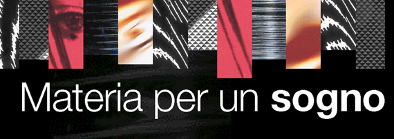 |
Un’eleganza classica e sobria accomuna le ventidue fragranze femminili e maschili candidate al Premio Accademia del Profumo (in lizza, ovviamente, i lanci 2003).
Nel gioco di rimandi fra materiali e simboli, sensazioni e fantasia, scopriamo gli “ingredienti” che le rendono uniche, a partire dalla confezione. Elena Piccinelli, Luciana Guidotti
Ogni anno il rito si compie, in apparenza sempre uguale, e ogni anno suscita (ancora!) curiosità ed eccitazione. In redazione fa il suo ingresso il Profumo: un ente che esiste ma non si vede, si percepisce coi sensi ma è fisico in maniera assai speciale, si sente ma solo per un po’, perché poi svanisce, lasciando una scia che sta allo spruzzo originario come il ricordo sta all’esperienza. Sembra “un” profumo, ma è tante cose diverse: il colore dell’astuccio, l’odore della fragranza, l’umidità vaporizzata del liquido, il freddo del vetro, il caldo del cartone... Ma è anche stratificazione di simboli di status e di genere, tassello voluttuoso dell’identità che vogliamo costruirci. È voglia di giocare, stuzzicando un senso ancestrale e, forse per questo, più capace di risvegliare gli altri. E con essi la fantasia.
A questa edizione del concorso accedono 11 fragranze femminili e altrettante maschili. A tutta prima, le confezioni sembrano molto “classiche”, di un’eleganza semplice, quasi uniforme. L’impressione è sottolineata dall’apparente omogeneità dei colori – molto rosa i profumi per Lei e azzurri per Lui – e dalla relativa sobrietà delle forme, con poche eccezioni che non incidono sulla media. Poi, poco a poco, iniziano a distinguersi le differenze. E comincia il divertimento. Con una sorpresa: tutto quel rosa percepito, in realtà, si deve a tre soli astucci, che spiccano per i cromatismi eccitanti, rispetto a cui gli altri appaiono più neutri. E lo stesso accade con l’azzurro dei prodotti maschili: tre anche in questo caso, che si stagliano sulla dominante grigia della maggioranza.
Dunque, i sensi ingannano! Ed è proprio questa illusione a creare il vuoto, quindi il mistero, poi colmato di pathos e fantasia. Ma, al contempo, sono proprio gli elementi materiali di un “profumo” (oltre all’odore della fragranza, la forma, il colore, la texture dell’imballaggio) da sperimentare con tutti i sensi, a far sì che possa essere “portato” e sentito, condiviso e giudicato, infine desiderato. Perché la materia è democratica in sè, è l’elemento di cui tutti possiamo fare esperienza e su cui, dunque, iniziamo a confrontarci.
La materia sfida lo spirito, quindi. E, sempre, conquista una vittoria, piccola o grande che sia. La scommessa di chi crea un profumo è proprio questa: individuare e comporre gli elementi materiali che sapranno aprirsi un varco nell’immaginario di ciascuno, ricreando la copia virtuale dell’oggetto, simile anche se non in tutto sovrapponibile all’originale.
Ecco, prodotto per prodotto, gli ingredienti - fatti di materia e colore, forme e dettagli, modelli umani di bellezza e racconti filmati per la pubblicità - che "costruiscono" i candidati all’edizione 2004 del premio Accademia.
|
|
The stuff of dreams
Classic, sober elegance is the common theme in the twenty-two fragrances for Her and for Him nominated for Accademia del Profumo Award (2003 launches in the list, of course). In this game of reminiscence, what with materials and symbols, sensations and the imagination, we discover the “ingredients” that make them so unique, starting with the pack. Elena Piccinelli, Luciana Guidotti
Every year the same service, apparently always the same, and yet every year it arouses curiosity and excitation (again!). Perfume enters the editor's office: something that exists but can't be seen. Something that's perceived by the senses, but is physical in a very special manner. Something that's sensed only for a brief while and then disappears, leaving a trace after the actual spray, much like a memory is the mere hint of the actual experience.
It seems “a” perfume, but it's a combination of many different things: the color of the box, the odour of the fragrance, the sprayed humidity of the liquid, the freshness of the glass, the warmth of the cardboard... And then it's also the layering of status and genre symbols, a voluptuous part of the identity we want to build for ourselves. It's the desire to play, teasing an innate sense and, perhaps for this very reason, one that's more likely to awaken the others. And with them, the imagination.
This year's edition of the competition sees 11 fragrances for Her and as many again for Him. At first sight, all the packs look very “classic”, with a simple almost uniform elegance. This impression is underlined by the apparent similarity of the colors used – lots of pink for the perfumes for Her and blue for Him – and relative sobriety of the shapes (with just a few exceptions that don't affect the overall impression). But then, little by little, the differences start to be seen. And the fun starts. With a surprise: all that perceived pink is really only due to just three packs, that stand out for their exciting use of color compared to the other more neutral packs. And the same is true of the blue used for the male products: three (again) stand out from the dominant grey used by the majority.
So our senses deceive us! And it's this very illusion that creates the vacuum and thus the mystery, to be filled by pathos and the imagination.
Yet, at the same time, the very material elements of a “perfume” (in addition to the smell of the fragrance, but the form, color and texture of the packaging) to be felt with all the senses, making it possible for the perfume to be “worn” and sensed, shared and judged, and even desired. Because matter is in itself democratic: it's the element we can all experience and so start to make comparisons.
Matter challenges the spirit, then. And, as always, wins a victory, be it big or small. The gamble of those who create perfumes is just this: to identify and arrange the various material elements capable of opening a breach in everyone's imagination, recreating a virtual copy of the object, that's similar even if not totally a superimposition of the original.
Here are the ingredients, product by product – matter and color, shape and details, human models of beauty and filmed tales for advertising – making up the candidates for the 2004 edition of the Accademia Awards.
|
 |
|
La forza del caso
Chance (Chanel)
L'audace rosa perlato dell’astuccio (proposto come segno di ottimismo), accostato al prezioso mélange oro e argento delle facce laterali; il cerchio perfetto disegnato dal flacone, la sola forma, pura e assoluta, degna di comparire accanto al quadrato del mitico N° 5; la purezza trasparente del vetro, inanellato di metallo a contenere l’incontenibile, ovvero l’impeto travolgente del caso. Un packaging di superlativi, eppure grazioso, armonico, “piccolo”: bell’esempio di classicismo reinterpretato secondo gli stilemi e la tecnologia della modernità, per una fragranza all’altezza della maison francese. In linea la bella brochure, naturalmente rosa, la statura dei professionisti che hanno composto il progetto (dal direttore artistico di Chanel, Jacques Helleu, al “naso” Jacques Polge, fino al regista dello spot Jean-Paul Goude) e l’aspetto della ragazza Chanel della comunicazione (la russa Anne Vyalitsyna).
Dello spirito e della natura
Eau Parfumée au Thé Blanc (Bulgari Parfums)
Presentata in concorso nella categoria dei femminili, in realtà la nuova eau parfumée di Bulgari è creata da Jacques Cavallier come profumo per tutti, uomini e donne desiderosi di concedersi un momento di freschezza, puntando sulla levità dell’acqua di colonia e sulla morbidezza delle note calde del tè, opportunamente aromatizzato di ambra e speziato di pepe. Sessualmente neutro, e quindi in un certo senso più “spirituale”, anche il packaging. Delicato e rigoroso insieme, fa tesoro dei giochi di luce generati dai rilievi bianchi e dal liscio argento sull’astuccio, esaltandosi nella trasparenza e nella satinatura del vetro (Design De Baschmakoff).
Vestire l’essenza
Essence d’Eau Gianfranco Ferré (ITF)
La sottile boccetta di cristallo scanalato, scettro dorato e morbida scultura dalle rotondità femminili, è sormontata da un “caldo” tappo di plastica che moltiplica i giochi di luce e l’effetto multidimensionale. È custodita in un prezioso astuccio di seta color crema, dagli inediti effetti tattili, e racchiude una fragranza dolce e sensuale dal cuore fiorito di narciso, rosa e gelsomino (Quest). Sobrio ed elegante come un abito del mitico stilista, l’involucro esterno di cartone e seta è realizzato con maestria da Cartografica Pusterla, mentre il flacone, progettato da Serge Mansau (Exergue), è prodotto da Pochet et du Courval. Tappo Matic Plast.
L’appassionata
FlowerbyKenzo Le Parfum (Kenzo Parfums)
Flower si veste di rosso passione, e seduce con la forza travolgente della femme fatale. Per la versione parfum del magnifico prodotto lanciato da Kenzo nel 2000, Research Studios Paris ha progettato un packaging di metallo satinato, che riproduce la forma arcuata dell’eau de toilette, e anche la silhouette tono su tono del fiore dallo stelo sottile, che culmina nella piccola corolla sul tappo. Scarlatto l’astuccio dal fondo opaco dove, accanto a un papavero appena più scuro, spiccano le sole scritte bianche di questo packaging ammaliante (bianca è anche l’anima interna, che stabilizza la boccetta). Intensa e potente ma aggraziata, la fragranza firmata da Alberto Morillas per Firmenich. Flowerbykenzo è proposto in tre versioni di capacità diversa: lo stelo scarlatto da 50 ml contiene un profumo concentrato al 18%; il flacone più grande, da 75 ml, contiene la variante al 12,5%, dalla texture più densa che “veste” la pelle; infine, il formato da 15 ml racchiude il fluido più concentrato (22%), di cui basta una goccia da posare sul collo o sui polsi.
Sfrontata con brio
La Perla Shiny Création (Morris div. Henkel)
La Perla si concede una parentesi frivola e inventa un profumo trendy, esuberante e luccicante. Lo ha chiamato Shiny, scintillante, e lo ha vestito di un rosa sofisticato, acceso di innumerevoli paillettes di luce che rendono irresistibile l’astuccio disegnato da Valneri e prodotto da Isem. All’interno troviamo il flessuoso flacone di K Design realizzato dalle blasonate Verreries Pochet et du Courval (con decorazioni Cerve), a sua volta rosa, così come la capsula di alluminio e politene Arsmetallo. La forma geometrica e slanciata del vetro è moderna e dinamica, anche grazie all’originale postura “inarcata” ed ergonomica e un quid di allegra sfacciataggine in più. E la fragranza? Originale e “peperina” su un fondo dolce che evoca lontani ricordi di rossetti della nonna; rende il profumo femminile e stuzzicante, e mette allegria.
Attimi di nobiltà
L’Instant de Guerlain (Guerlain)
Lucido, bianco abbagliante incorniciato d’oro, con il grande marchio circolare della casa parigina, oro e viola, a rilievo al centro dell’astuccio: L’Instant si presenta così, importante e nobile, e la boccetta non smentisce. Realizzata in purissimo cristallo spesso e pesante (così come il grande cabochon che la sormonta come un cappello), nella forma rievoca il contorno di uno stemma. Animato da eteree nuances color ametista, il profilo interno del flacone accoglie il liquido in un insieme armonico, classico e moderno a un tempo, per un prodotto che presenta i tratti distintivi del lusso. Coerente e solidale la fragranza, firmata da Maurice Roucel, che ha introdotto nella delicata architettura di accordi ambrati cristallini una nota di magnolia cinese, attraversata da un luminoso miele di agrumi. Da sfogliare la brochure di presentazione.
Amori magici
Incanto, Salvatore Ferragamo (ITF)
È una Cenerentola del nostro tempo la Donna del “calzolaio dei sogni” (così è chiamato Salvatore Ferragamo): femminilità fatata, scrigno di una bellezza colta nel magico istante in cui si rivela. A lei lo stilista ha dedicato una suggestiva fragranza di IFF, dolce come l’amore, racchiusa in un’eterea boccetta ellittica di cristallo dall’“ombelico” concavo creata da Serge Manseau. Ed è proprio questa trasparenza del vetro (Bormioli Luigi) - richiamata dall’elegante tappo luminoso in Surlyn fornito da Candiani e dall’invisibile pompa di Valois - che consente il gioco di rimandi fra il nome rosso del profumo impresso sul fronte del flacone, e la firma dorata dello stilista stampata sul retro, in secondo piano (serigrafie Cerve). Firma che in parte si legge, rimpicciolita, anche attraverso l’incavo centrale che fa da lente e “fuoco” dell’intera confezione. Grande cura anche per l’astuccio di cartone, realizzato da La Poligrafica, con interni in microonda di E. Siani: geometrico e moderno, dallo sfondo d’argento spazzolato, è dominato da una larga finestra quadrata color dell’oro fuso nel laboratorio dell’alchimista.
Futuribile realista
Omnia (Bulgari Parfums)
Bulgari non si smentisce e anche per il suo ultimo profumo femminile sceglie un packaging decisamente fuori standard. Progettato da Fabrice Legros, rompe tutti gli schemi della bottiglia classica e si fa scultura, con espliciti richiami, nella forma, alla tradizione di design del gioielliere. Proiezione futurista di linee, volumi e colori, appare come l’intersezione di due anelli di una catena, o - ancora - come materializzazione del simbolo dell’infinito. Decisiva la scelta dei materiali: la netta lucentezza del metallo, che costituisce la superficie dei cerchi, racchiude un cuore di vetro cangiante dal caldo colore del caramello. Ma non è tutto: per consentire l’accesso al profumo, il cerchio che contiene il foro erogatore deve essere mobile (è qui che si fa pressione per nebulizzare il profumo), e per questo è stato realizzato in plastica, con una tale maestria da apparire identico al gemello di vetro, anche nelle sfumature cromatiche. Il luminoso astuccio metallizzato, che riprende il colore della contenitore, è stato realizzato da Cartografica Pusterla e riporta all’interno due immagini che spiegano dove premere per erogare il profumo.
Lettera d’amore
Romeo Gigli (ITF)
Piccolo, prezioso, deliziosamente tondeggiante e misterioso. La boccetta cristallina che contiene l’eau de parfum Romeo Gigli si presenta come una levigata pietra di luce, dove una civiltà antica sembra aver inciso messaggi misteriosi. Progettata da Serge Mansau, con vetro firmato Bormioli, è racchiusa in un raffinato astuccio color asfalto e oro antico con scritte d’argento, firmato Cartografica Pusterla, che enfatizza il fascino della citazione. Perché, viste da vicino, le strane scritte serigrafate sul vetro e “incise” sul cartone non sono altro che un inno all’amore assoluto tratto dal Romeo e Giulietta di Shakespeare. Dolce ed elegante la fragranza della famiglia olfattiva “fiorito trasparente fruttato”, sapientemente costruita da IFF con fresche note di testa su un cuore intrigante di fiori e liquirizia e un fondo di vellutata sensualità. Tappo Maticplast.
Terra di contrasti
Sicily Dolce e Gabbana (Euroitalia)
Classico ed essenziale, sorta di passe-partout dell’eleganza, il nero è anche il non-colore per eccellenza, tanto da essere prediletto nell’adolescenza, età dell’indeterminatezza in cui tutto (o quasi) è ancora possibile. Ma in Dolce & Gabbana assume una sfumatura diversa. Sarà che siamo condizionati dall’immagine forte, provocatoria e riconoscibile che identifica le creazioni e la comunicazione della celebre coppia di stilisti; sarà che “questo” nero (quello dell’astuccio e quello del tappo) interagisce con il lettering e il colore del marchio, e con il rigore quasi severo delle linee squadrate; sarà, ancora, la forza evocativa di una fragranza intensa e stordente come gli aromi di Sicilia… Sarà tutto questo con in più la bellezza sensuale di Monica Bellucci “fotografata” in bianco e nero da Tornatore che firma lo spot… Il risultato è un prodotto a un tempo severo, vulcanico e solare, insomma tutt’altro che indeterminato… Intensa e passionale la fragranza, con una “coda” di ammaliante eliotropio che sorprende.
Eterno femminino
Very Irresistible Givenchy
(Parfums Givenchy)
Il profumo è uno spettacolo, con protagonista chi lo indossa. Su questo assunto, Givenchy ha costruito la presentazione della nuova fragranza rosa, “trainata” dal fascino di una Liv Tyler fotografata in bianco e nero da Mario Testino. Non semplicemente irresistible, ma “very” irresistible, gioca a coniugare quel certo-non-so-che alla francese con la trainante modernità anglosassone. Alla rosa centifoglia del cuore del profumo fa eco la boccetta creata da Pablo Reinoso (Cent Degrés), slanciata e lievemente ritorta, dalla tonalità cangiante e sfumata, e chiusa da un cristallino tappo triangolare. Nulla è lasciato al caso: torsione in inglese si traduce “twist”, che significa anche fascino; e la boccetta a un tempo pesante e lieve, esprime dinamismo, rivelando spigoli, riflessi e angoli sempre nuovi a seconda di come la si muove. Anche la fustella, di un vivace rosa metallizzato e cangiante, riproduce e riflette bagliori di luce.
|
|
The strength of chance
Chance (Chanel)
The daring pearly pink of the box (proposed as a sign of optimism), flanked by the precious mix of gold and silver in the side strips; the prefect circle of the bottle, the only truly pure and absolute shape, worthy of appearing next to the squareness of the legendary Chanel N° 5; the transparent purity of the glass, with a metal ring to contain what really can't be contained, i.e. the overwhelming impetus of chance. Superlative packaging, yet with a certain gracefulness, harmony and “small”: a fine example of classicism given a new interpretation according to the stylistic features and technology of the modern day. A fragrance well worthy of this French perfumery. Equally so, the beautiful brochure (pink of course) and the standing of the professionals responsible for the project (from Chanel's Artistic Director, Jacques Helleu, to the “nose”, Jacques Polge, and the director of the advertising spot, Jean-Paul Goude), not to mention the look of the Chanel girl used in the ads (the Russian Anne Vyalitsyna).
Of the spirit and nature
Eau Parfumée au Thé Blanc (Bulgari Parfums)
Although competing in the female category, in realty the new eau parfumée from Bulgari has been created by Jacques Cavallier as a perfume for all, men and women alike in the search for a moment of freshness, with the lightness of eau de Cologne and the softness of the warm notes of tea, cleverly aromatised by amber and spiced up with pepper.
Also the packaging is sexually neutral, and thus in a certain sense more "spiritual".
Delicate yet strict, it exploits the effect of light generated by the white highlights and the smooth silver of the box, revelling in the transparency and satin effect of the glass (Design De Baschmakoff).
Dressing essence
Essence d’Eau Gianfranco Ferré (ITF)
The thin grooved glass bottle, the golden sceptre and soft sculpture of typical female roundness, is topped by a “warm” plastic cap that multiples the play of light and multiple dimensional effects. Stored in a fine cream-colored silk box with an unprecedented feel to it, enclosing a sweet, sensual fragrance with a flowery heart of narcissus, rose and jasmine (Quest). Sober and elegant, as if dressed in one of this famous designer's creations, the external wrapping consisting of cardboard and silk is masterly done by Cartografica Pusterla, while the bottle designed by Serge Mansau (Exergue) is produced by Pochet et Du Courval. Cap: Matic Plast.
The passionate one
FlowerbyKenzo Le Parfum (Kenzo Parfums)
Flower is dressed in passionate red and seduces with the overwhelming force of the femme fatale. For the parfum version of the great product launched by Kenzo in 2000, Research Studios Paris has designed a satin-finish metal packaging, reproducing the sharp shape of the eau de toilette and the shaded silhouette of the flower with its thin stem culminating in the small corolla on the cap. The box is scarlet, with a matt base and the white wording next to a slightly darker red poppy: attractive packaging (white is also used for the core inside which holds the bottle). The fragrance by Alberto Morillas for Firmenich is intense and powerful, yet graceful. Flowerbykenzo comes in three versions with different capacities: the 50 ml scarlet stem contains an 18% concentrate perfume; the larger size (75 ml) contains the 12.5% variant with a more dense texture that “clothes” the skin; lastly, the 15 ml format contains the highest concentration (22%) where just a drop of this on the pulse or neck is enough.
Cheerfully impudent
La Perla Shiny Création (Morris div. Henkel)
La Perla takes a frivolous break and invents a trendy, exuberant and sparkling perfume. Called Shiny, it's clothed in a sophisticated pink, lit up by thousands of sequins making the box irresistible (designed by Valneri and produced by Isem). Inside is the supple bottle by K Design made by the famed Verreries Pochet et du Courval (decorations by Cerve), also pink, as is the aluminium/polythene Arsmetallo cap. The geometric, streamlined form of the glass is modern and dynamic, thanks also to the original “arched” ergonomic posture and a certain cheerful brazenness. And the fragrance? Original and “peppery” with a sweet background evoking distant memories of a granny's lipstick; making this a feminine, provoking perfume, spreading cheer around.
Moments of nobility
L’Instant de Guerlain (Guerlain)
Shiny, dazzling white framed in gold, with the Paris house's big circular logo in gold and purple in relief in the centre of the box: that's how L’Instant presents itself, important and noble. And the bottle lives up to expectations: made from pure crystal glass, thick and heavy (as is the big cabochon on top, like a hat), its shape recalls the outline of a coat of arms. Enlivened by ethereal amethyst nuances, the inner profile of the bottle embraces the liquid creating a harmonious, classic yet modern combination for a product that's definitely a luxury good.
The fragrance by Maurice Roucel is coherent, in line with the packaging; Roucel has introduced a note of Chinese magnolia in the delicate architecture of crystalline amber chords, spiked with a bright citrus honey. The brochure makes for good reading.
Magic loves
Incanto, Salvatore Ferragamo (ITF)
A modern Cinderella story: the woman of the “cobbler of dreams” (that's what they called Salvatore Ferragamo). Enchanting femininity, a casket of rare beauty captured at the moment of being unveiled. The designer has dedicated an entrancing IFF fragrance A for her, as sweet as love, enclosed in an ethereal elliptical glass bottle with the concave “navel” created by Serge Manseau. And it's this very transparency of the glass (Bormioli Luigi) - stressed by the elegant luminous top made from Surlyn (Candiani) and the invisible pump (Valois) - allowing for the game between the name of the perfume in red on the front of the bottle and the golden signature of the designer on the rear, in less relief (screen printing by Cerve). This signature can also be read, though smaller, through the central recess that acts as a lens and “focus” for the entire pack. Great care has also been taken over the cardboard box by La Poligrafica, with micro corrugated interior by E. Siani: geometric and modern, with a brushed silver base, it's dominated by a large square window, the color of molten gold in an alchemist's lab.
Futuristic realism
Omnia (Bulgari Parfums)
Bulgari lives up to its reputation and goes for a truly non standard for its latest perfume for Her. Designed by Fabrice Legros, it breaks with tradition and turns the bottle into a piece of sculpture with explicit references in its shape to the traditions of jewellery design. A futuristic projection of lines, volumes and colors, it looks like the intersection of two links in a chain or - again - as the materialisation of the symbol of infinity. The choice of materials is crucial: the sharp shine of the metal used for the surfaces of the circles encloses a heart of sparkling glass, a warm caramel color. But that's not all: to access the perfume, the circle containing the dispenser hole must be mobile (this where one presses to spray the perfume) and so this has been made from plastic with such art that it looks identical to its glass twin, even in hue. The shiny metal box that picks up the color of the container is produced by Cartografica Pusterla and has two images on the inside that explain where to press to release the perfume.
Love letter
Romeo Gigli (ITF)
Small, precious, deliciously round and mysterious. The glass bottle containing the Romeo Gigli eau de parfum looks like a smooth, luminous stone, which an ancient civilisation has inscribed with mysterious messages. Designed by Serge Mansau, glass by Bormioli, the bottle is housed in a refined asphalt grey and antique gold box with silver wording (by Cartografica Pusterla), stressing the charm of the quotation. Because, when seen close up, the strange words screen printed on the glass and “engraved” in the cardboard are none other than a celebration of absolute love, taken from Shakespeare's Romeo and Juliet. The fragrance is sweet and elegant belonging to the “flowery and clearly fruity” olfactory family cleverly made up by IFF with fresh head notes on an intriguing heart of flowers and liquorice and a velvety sensual background. Cap by Maticplast.
Land of contrasts
Sicily Dolce & Gabbana (Euroitalia)
Classic and essential, a sort of passe-partout of elegance, black is also the non-color par excellence, favoured by adolescents, the age of indetermination when everything (or almost everything) is still possible. However it takes on a different aspect at Dolce & Gabbana. Maybe it's because we're conditioned by the strong, provocative, clearly recognisable image that identifies the creations and messages from this famous pair of designers; maybe it's because “this” particular black (that used for the box and the cap) interacts with the lettering and the color of the brand, and with the almost severe rigour of the square lines; or again, maybe it's because the evocative strength of the intense, staggering fragrance, like the aromas of Sicily… All this, plus the sensual beauty of Monica Bellucci “shot” in black and white by Tornatore, author of the TV spot… The result is a product that's both severe, volcanic and sunny, anything but undetermined… The fragrance is intense and passionate, with a surprising bewitching sun seeking “end note”.
Eternal femininity
Very Irresistible Givenchy (Parfums Givenchy)
Perfume is a show and the star is the person wearing it. Givenchy has built the presentation of his new rose fragrance around this assumption, “aided” by the fascination of Liv Tyler shot in black and white by Mario Testino. Not just irresistible, but “very” irresistible, helping wed that je ne sais quoi with the driving force of Anglo Saxon modernity. The Rosa centifolia at the heart of the perfume is echoed by the bottle created by Pablo Reinoso (Cent Degrés): slim and slightly twisted, with sparkling shaded hues, it's topped by a triangular glass cap. Nothing is left to chance: “twist” also means fascination and the bottle is both heavy and light, with a certain dynamism, constantly offering new angles, reflections and edges, depending on how it's moved. Also the box - a lively, sparkling metallic pink - reproduces and reflects shafts of light.
|
|
 |
|
Icone d’acqua
Alessandro dell’Acqua Man (Euroitalia)
Una fragranza che sembra sprigionare dalla brezza marina: questa la suggestione ispiratrice dell’architettura odorosa che innesta, su un fondo seducente di legni, le note frizzanti degli agrumi e un sapiente mélange di spezie e fiori. Per Alessandro dell’Acqua Man è stata creata una confezione semplice e suggestiva, che riprende i cromatismi della sabbia e del mare: nelle piccole icone che colorano la fustella nera e minimalista, ma anche, a sorpresa, nell’anima interna in microonda, viola come un cielo vespertino. Dentro, una gentile boccetta ergonomica dalle linee arrotondate e dalla chiusura in metallo nero, ammorbidito dalla satinatura, dove ricompare – elemento distintivo e decoro insieme - il profilo delle icone.
Intensità al potere
Aramis Life (Aramis, div. Estée Lauder)
Al blu metallizzato, luminoso ed energetico dell’astuccio, che riproduce i rilievi ondulati del flacone, spetta il compito di introdurre Aramis Life. Ispirato alla leggenda del tennis Andre Agassi, campione fortemente impegnato nel sociale, il profumo è dedicato all’uomo moderno, ai suoi progetti e alla forza che supera ostacoli e difficoltà. Il tema è interpretato da una fragranza originale, vivace e sofisticata, basata su un estratto di legno d’olivo, per la prima volta compreso in una profumazione grazie all’impiego di un’esclusiva tecnologia di estrazione. Modernamente classico, e studiato nel dettaglio, il packaging. Così, se l’azzurro luminoso della scatola emana trasparenza e intensità, la profilatura in argento richiama un’idea di razionalità e di potere. E il flacone ergonomico, solido e tattile, è scolpito nel vetro blu soffiato a freddo, chiuso dal grande tappo monogrammato d’acciaio lucido.
Tensione allo stato puro
Dior Higher Energy (Parfums Christian Dior)
L’energia pura del pensiero come vera forza dell’uomo, che trascende i limiti della realtà se si lascia coinvolgere dall’emozione. Dior interpreta la potenza come unione di sensibilità e volontà, e il potere come capacità di comprendere. A questo tipo di forza, tutta spirituale, si ispira Higher Energy, che la rappresenta come un lampo di luce (artificiale). Verde elettricità, dunque, la fustella metallizzata, dove la tensione a elevarsi è espressa dalla sequenza di linee orizzontali sempre più spaziate, e dai bagliori emessi dalla boccetta di cristallo, simbolo di verità. Semplice e vigoroso, il flacone slanciato culmina in un grande tappo elegante d’argento, che riporta le cifre del mitico stilista francese e sembra racchiudere in sé i lampi di freschezza elettrica emessi dal liquido prezioso. Elegante la fragranza, aperta da note di ginepro e pompelmo, dal palpitante cuore di spezie.
Le ali della libertà
Echo Davidoff
(Coty Italia, div. Lancaster Group)
Ultra-piatto e mosso da un inaspettato rigonfiamento centrale che rende “vivo” il vetro, l’originale flacone di Echo è a un tempo palpito di vita ed espressione di tecnologia. L’erogatore di metallo color argento, decentrato su un angolo del contenitore, si fa immaginare come occhio e becco di uccello esotico. Un uccello marino, senza dubbio, che pesca, con la pompa trasparente, nelle acque verdi e azzurre del lago profumato della modernità urbana. Assai più che contenitore, questo è il packaging creato da Karim Rashid per l’ultima fragranza maschile a firma Davidoff, seguendo il minimalismo sensuale che ne ispira l’estetica. La fragranza, anch’essa sofisticata e originale, è creata da Alain Astori per IFF su un primo “canovaccio” di Braja Mookherjee.
Effetto uomo
Gucci pour Homme (Cosmopolitan Cosmetics)
Gucci gioca pesante e propone la nuova fragranza maschile in un massiccio cubo di vetro, sormontato da un solido tappo nero dai riflessi ferrosi, che completa la struttura. Versione virile dell’analoga boccetta tondeggiante “per Lei” di Tom Ford, assume tutti i caratteri classici della mascolinità: forma squadrata e spigolosa, impiego del metallo per i complementi, spessore esagerato della base e delle pareti. Sorprende, per contrasto, il prezioso “effetto luce” creato, per rifrazione, dalla fitta incisione che muove la base del flacone (alleggerendo l’intero packaging e amplificando le sfumature di colore del prezioso jus ambrato) oltre a suscitare una piacevole sensazione tattile di (maschia) ruvidezza. Elegante l’astuccio optical, disegnato a motivi geometrici seriali in bianco e nero, dove campeggia il marchio; speziata-legnosa la fragranza sensuale e raffinata.
Colpo di genio
Intuition for Men (Estée Lauder)
Presentata in un elegante astuccio sottile dai toni mattone e ruggine che evocano i più sensuali colori di boschi, spezie e sete, la nuova fragranza di Estée Lauder for Men sorprende per la freschezza, che illumina il cuore caldo di ambra fossile e legni odorosi. Capostipite della nuova famiglia olfattiva Orientale Solare, l’originale bouquet di note vibranti e sensuali assegna un’inedita levità alla tradizione delle essenze levantine. E il levigato flacone cristallino la riflette: snello e trasparente, presenta un largo incavo che pare una pietra modellata dal tempo. Il segno scolpito sul fronte del vetro, il movimento asimmetrico del contenitore, il tappo trasparente dalle linee arrotondate che mostra l’erogatore color ruggine, i riflessi cromatici sapientemente creati dal fondo colorato… Tutto contribuisce a creare un insieme coerente e solidale che incarna il concetto ispiratore del profumo: quell’istinto originario e sensuale che genera l’Intuition, vera forza creativa e agente propulsivo di genio. Design Estée Lauder, immagine Inez Van Lamsweerde and Vinoodh Matadin.
Nel blu
KenzoAir (Kenzo Parfums)
Un pezzo di cielo imprigionato nel ghiaccio, porzione d’azzurro racchiusa fra gli indici e i pollici di un bambino. È il suggestivo flacone-scultura creato in collaborazione con Laura de Santillana, che espone nei grandi musei del mondo e discende da una celebre schiatta di vetrai veneziani. Lavora il vetro soffiato in un modo inusuale, giocando sui toni di colore come un pittore e contrastando le leggi della materia, fino a creare “cubi d’aria”. Così è anche per il massiccio flacone “ghiacciato” di KenzoAir, realizzato da Saint Gobain in un unico pezzo di vetro, senza tappo. Innovativo il foro di erogazione ricavato sul fronte, così come originale e complessa è la colorazione del materiale. Il profumo trasparente è contenuto in una tasca di materiale plastico opaco, che si adatta al retro del contenitore. Sfumature celesti anche per la fustella, a completare il racconto.
Rivoluzione dei sensi
Rive Gauche pour Homme (YSL Beauté)
Un cilindro slanciato di metallo color prugna (profondo come il nero), dalle larghe bande acciaio luminose. È il contenitore moderno e aggressivo creato per la fragranza maschile che il marchio Yves Saint Laurent ha dedicato alla riva sinistra della Senna, icona della bohème francese e del ’68 studentesco in tutto il mondo. Côté masculin del contenitore nero e azzurro che ha lanciato, negli anni Settanta, la versione femminile del celebre profumo, ne riprende il concetto rivoluzionario - libero, sexy, ultramoderno - che connota lo stile Tom Ford per YSL. All’altezza del mitico stilista, la fragranza fougère-boisé, dalle fresche note di testa che liberano un maschio cuore aromatico sul fondo di legni e di sensuale patchouli.
La libertà della natura
Roberto Cavalli Man (ITF)
Di estrema semplicità e nitore, il flacone di vetro e metallo creato da Serge Mansau e realizzato da Pochet per Roberto Cavalli Man, riprende le linee e le proporzioni della più classica delle architetture. Al sinuoso serpente bicefalo, che si erge sulle due facce del vetro, simbolo di eros ed emblema dello stilista, il compito di richiamare il Cavalli-pensiero: un inno alla sensualità libera da freni e convenzioni, da vivere con fierezza. Prorompente e provocante interprete di un moderno fauvisme, lo stile del couturier italiano si ritrova nella fustella azzurra e perla, realizzata in cartoncino Star Dream da Cartografica Pusterla, dove si intrecciano fantastici manti maculati di fiere in libertà. Ricca di suggestioni la fragranza, costruita da Firmenich su un fondo di sandalo e mirra, con il vigore del cuoio e del legno e la seduzione dell’assenzio…
Padrone di emozioni
Truth Calvin Klein Men, Unilever Cosmetics (Calvin Klein Cosm.)
Calvin Klein, poeta dello chic minimalista, presenta il suo ultimo profumo maschile in una boccetta lineare e pura, disegnata da Fabien Baron. Elegante e funzionale, offre un ampio fronte basso dove campeggia il marchio, sovrastato dal grande tappo d’acciaio in cui scompare il pulsante dell’erogatore. Ma, vista di profilo, rivela un’inaspettata inclinazione diagonale che imita la postura rilassata di un uomo, padrone di se stesso e dello spazio che, senza parlare di sé, comunica genuina sensualità. Fortemente distintivo anche il colore verde acqua dell’essenza, firmata Givaudon, che alle prime deliziose note fresche fa seguire un cuore verde e solare insieme, fatto di basilico e cardamomo, patchouli bianco e legni esotici. Essenziale e raffinata la fustella d’argento dalle sottili scritte nere.
Bere la vita
Versace Men (Giver Profumi)
L’astuccio viola a incastro segnato da una sottile linea fluorescente, realizzato da Cartografica Pusterla-Coffrets Création, è un piccolo capolavoro di perfezione artigianale. Goffrato a imitare una pelle di coccodrillo, con le scritte d’oro che illuminano il fronte e un interno lilla che pare di seta, inverte le proporzioni fra corpo e tappo, che caratterizzano la boccetta. Disegnato da Donatella Versace in collaborazione con ar/media e Tino Valentinitsch, il flacone riprende le forme della più classica bottiglia di brandy, ed è dominata da un diffuso viola elettrico che allude all’atmosfera dei locali notturni. Repertorio da club per soli uomini, dunque, per una fragranza esplicitamente sensuale, della famiglia legnosa-speziata-orientale, firmata IFF. Fra i molti dettagli di pregio, il vetro pesante dal bordo zigrinato, lavorato dalle Vetrerie Bormioli Luigi, il grande tappo di plastica viola realizzato da Maticplast e la sottilissima frette, d’oro scuro come l’erogatore, che segna il confine fra contenitore e chiusura con una targa firmata Versace.
|
|
Water icons
Alessandro dell’Acqua Man (Euroitalia)
A fragrance that seems to send forth sea breezes: this is the inspiring idea one gets from this fragrant architecture that grafts the effervescent notes of citrus fruit and a clever mix of spices and flowers onto a seductive woody background. A simple, evocative pack for Alessandro dell’Acqua Man, picking up on the colors of sand and sea: the small icons coloring the black, minimalist die-cut box, plus the surprise of the micro corrugated inner core that's as purple as an evening sky. Inside, a delicate ergonomic bottle with rounded lines and a black metal cap, somewhat softened by the satin finish, which again bears the outline of the icons – the distinctive, yet decorative element.
Intensity to power
Aramis Life (Aramis, div. Estée Lauder)
Metal blue - full of light and energy in this box that reproduces the wavy lines of the bottle - has been given the task to introduce Aramis Life. Inspired by the tennis legend Andre Agassi, a champion with a great interest in social matters, this perfume is dedicated to the modern man, his projects and strength that overcomes all obstacles and difficulties. This theme is interpreted by an original, vivacious and sophisticated fragrance, based on olive wood extract, for the very first time used in a perfume thanks to an exclusive extraction technology. Modern yet classic packaging, with great attention to detail. Thus, while the bright blue of the box gives the idea of transparency and intensity, the silver profiling recalls rationality and power. And the ergonomic, solid, tangible bottle is sculpted out of cold blown blue glass, sealed on top by the large monogrammed polished steel cap.
Pure tension
Dior Higher Energy (Parfums Christian Dior)
The pure energy of thought seen as the true strength of mankind, transcending the limits of reality when allowed to get mixed up with emotion. Dior interprets strength as the union of sensitivity and will, and power as the ability to understand. Higher Energy aspires to this type of force - spiritual force - represented as a flash of (artificial) light. Electric green, therefore, for the metallic box, where the pressure to raise oneself is expressed by the sequence of horizontal lines that grow further and further apart and by the flashes coming from the glass bottle, the symbol of truth. Simple and strong, the slim bottle culminates in a large elegant silver cap bearing the logo of the great French designer, seeming to encompass the flashes of electric freshness coming from the precious liquid. An elegant fragrance, opening with notes of juniper and grapefruit, with a beating heart of spice.
The wings of freedom
Echo Davidoff (Coty Italia, div. Lancaster Group)
Ultra-flat and galvanised by an expected swelling in the centre that “brings the glass to life”, the original Echo bottle is both a true temple of life and an expression of technology. The silver metal dispenser, offset on a corner of the container, gives one the impression of an exotic bird's eye and beak. A marine bird, without a doubt, that fishes with the transparent pump in the green and blue waters of the perfumed lake of urban modernity. Much more than a container, this is the packaging created by Karim Rashid for the latest male fragrance from Davidoff, the aesthetics suiting its sensual minimalism. The fragrance, equally sophisticated and original, has been created by Alain Astori for IFF based on an initial “canvas” by Braja Mookherjee.
Man effect
Gucci pour Homme
(Cosmopolitan Cosmetics)
Gucci plays heavily and proposes its new fragrance for Him in a solid cube of glass, topped by a solid black cap with iron reflections, completing the structure. A virile version of the similar rounded bottle “for Her” by Tom Ford, it assumes all the classic characteristics of the male of the species: a square jutting shape, the use of metal for the accessories, exaggerated thickness at the bottom and sides. Quite surprising, therefore, is the clever contrasting “light effect” created through refraction of the close engraving that moves the bottom of the bottle (making the whole packaging lighter and amplifying the shading of the precious amber jus), as well as arousing a pleasant tactile sense of (masculine) roughness. The optical box is elegant, with its serial geometric patterns in black and white, dominated by the brand; the fragrance is spicy and woody, sensual and refined.
The mark of a genius
Intuition for Men (Estée Lauder)
Presented in an elegant, slim brick and rust colored box evoking the more sensual colors of woodland, spices and silk, the new Estée Lauder for Men fragrance is surprisingly fresh, brightening up the warm heart of fossil amber and perfumed wood. The head of the new Orientale Solare family of fragrances, the original bouquet of vibrant, sensual notes gives an unusual levity to the tradition of Levantine perfumes. And the polished glass bottle reflects this: slim and transparent, it has a wide recess that looks like a stone shaped over the years. The sign sculpted in the front of the glass, the asymmetric movement of the container, the transparent cap with its rounded lines showing the rust-colored dispenser, the colored reflections cleverly created thanks to a colored base… Everything helps create a coherent, solid whole, embodying the inspiring concept of the perfume: the original and sensual instant that generates Intuition, the true creative power and driving force of genius. Design: Estée Lauder; image: Inez Van Lamsweerde and Vinoodh Matadin.
In the blue
KenzoAir (Kenzo Parfums)
A piece of sky trapped in ice. A portion of blue caught between a child's forefinger and thumb. This is the attractive bottle/sculpture created in collaboration with Laura de Santillana, who shows her work in the world's leading museums and comes from a famous family of Venetian glassworkers. She works the blown glass in an unusual manner, playing with the shades of color like a painter and opposing the laws of the material to create “cubes of air”. Likewise, also the solid “iced” bottle for KenzoAir (produced by Saint Gobain) is a single piece of glass, without a top. The dispenser hole on the front is quite innovative, just as the coloring of the material is complex and original. The transparent perfume is contained in a pocket of matt plastic that fits the back of the container. The diecut box - also in shades of blue - completes the story.
Revolution of the senses
Rive Gauche pour Homme (YSL Beauté)
A slim metal cylinder colored plum (as dark as black) with wide bright steel bands. This is the modern, aggressive container created for the male fragrance from Yves Saint Laurent dedicated to the left bank of the River Seine, the icon of French bohemia and the ’68 student uprisings around the world. The côté masculin of the black and blue container that launched in the female version of the famous perfume in the '70s, picks up the same revolutionary concept - free, sexy, ultramodern - typical of Tom Ford's style for YSL. Measuring up to the famous designer, the fougère-boisé fragrance with its fresh head notes that release an aromatic male heart on a background of wood and sensual patchouli.
The freedom of nature
Roberto Cavalli Man (ITF)
Extremely simple and clean, the glass and metal bottle created by Serge Mansau and produced by Pochet for Roberto Cavalli Man picks up the lines and proportions of the most classic architectural styles. The sinuous two-headed snake that rises on both sides of the glass is the symbol of Eros and the emblem of the designer. The task here is to recall the Cavalli-thought: in praise of unfettered sensuality, unbound by convention, to be lived daringly. The unstoppable, provocative interpreter of a modern form of Fauvism, the style of this Italian couturier is seen in the blue and pearl box made from Star Dream card from Cartografica Pusterla, a web of fantastic speckled skins of unshackled wild beast. The fragrance - the work of Firmenich - abounds with suggestions on a background of sandalwood and myrrh, plus the vigour of leather and wood, and the seduction of absinth…
Master of emotion
Truth Calvin Klein Men, Unilever Cosmetics (Calvin Klein Cosm.)
Calvin Klein, poet of minimalist chic, presents his latest perfume for Him in a linear, pure bottle designed by Fabien Baron. Elegant and functional, it has a wide low front dominated by the brand and is topped by a large steel cap with the dispenser button hidden inside.
But, when seen from the side, the bottle has an unexpected diagonal slant that imitates the relaxed posture of a man, master of himself and the space that gets across a genuine impression of sensuality, without the need for words. Just as distinctive is the aquamarine of the perfume by Givaudon, which opens with some fresh notes, followed by a green, sunny heart, thanks to basil and cardamom, white patchouli and exotic wood. The silver box with its fine black lettering is essential and refined.
Drink of life
Versace Men (Giver Profumi)
The purple slotted box with its thin fluorescent line (by Cartografica Pusterla-Coffrets Création) is a small masterpiece of perfect craftsmanship. Embossed to imitate crocodile skin, with golden lettering that lights up the front and a lilac interior that looks like silk, it inverts the proportions between body and cap of the bottle. Designed by Donatella Versace in collaboration with ar/media and Tino Valentinitsch, the bottle is reminiscent of the classic brandy bottle and is dominated by diffused electric purple alluding to the atmosphere of nightclubs. A men's club repertoire, therefore, for a fragrance that's explicitly sensual, of the woody-spicy-oriental family and by IFF.
The many worthy details include the heavy glass with its knurled edge produced by Vetrerie Bormioli Luigi, the large purple plastic cap by Maticplast and the extra fine shoulder dark golden like the dispenser, marking the border between the container and the closure with a "Versace" tag.
|
|
|
|